Tabs 组件 (Tabs,TabContent)
ArkUI 开发框架提供了一种可以通过页签进行内容视图切换的容器组件,每个页签对应一个内容视图的容器组件 Tabs ,它允许包含子组件且子组件只能是 TabContent ,本节笔者介绍一下 Tabs 的简单使用。
Tabs 定义介绍
interface TabsInterface {
  (value?: { barPosition?: BarPosition; index?: number; controller?: TabsController }): TabsAttribute;
}

declare enum BarPosition {
  Start,
  End,
}- barPosition:指定页签位置来创建 Tabs 容器组件, BarPosition 定义了以下两种类型:
Start(默认值):当 vertical 属性方法设置为 true 时,页签位于容器左侧; vertical 属性方法设置为 false 时,页签位于容器顶部。
End: vertical 属性方法设置为 true 时,页签位于容器右侧; vertical 属性方法设置为 false 时,页签位于容器底部。
index:指定初次初始页签索引,默认值为 0 。
controller:设置 Tabs 控制器。
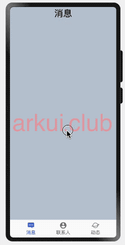
简单样例如下所示:
@Entry @Component struct SideBarContainerTest {

  private controller: TabsController = new TabsController();

  build() {
    Column() {
      Tabs({// Tabs不设置vertical属性时,默认上下排版
        barPosition: BarPosition.Start,
        controller: this.controller
      }) {
        TabContent() {
          Column()
            .width('100%')
            .height('100%')
            .backgroundColor("#aabbcc")
        }
        .size({width: "100%", height: "100%"})
        .tabBar("消息")

        TabContent() {
          Column()
            .width('100%')
            .height('100%')
            .backgroundColor("#bbccaa")
        }
        .size({width: "100%", height: "100%"})
        .tabBar("联系人")

        TabContent() {
          Column()
            .width('100%')
            .height('100%')
            .backgroundColor("#ccaabb")
        }
        .size({width: "100%", height: "100%"})
        .tabBar("动态")
      }
      .size({width: "100%", height: "100%"})
    }
    .width('100%')
    .height('100%')
    .padding(10)
  }
}样例运行结果如下图所示:
Tabs 属性介绍
declare class TabsAttribute extends CommonMethod<TabsAttribute> {
vertical(value: boolean): TabsAttribute;
scrollable(value: boolean): TabsAttribute;
barMode(value: BarMode): TabsAttribute;
barWidth(value: Length): TabsAttribute;
barHeight(value: Length): TabsAttribute;
animationDuration(value: number): TabsAttribute;
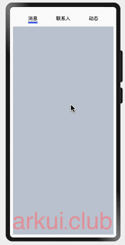
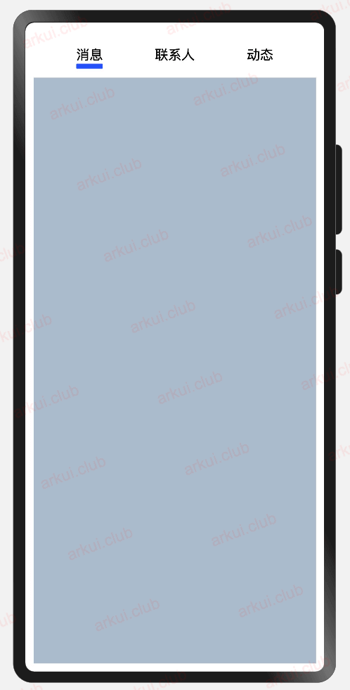
}vertical:
设置 Tab 是否为左右排列,默认为 false ,表示上下排列。
- vertical 设置为 false:
- barPosition: BarPosition.Start
Tabs({
  barPosition: BarPosition.Start, // 设置Tab在上方
  controller: this.controller
}) {
  TabContent() {
    Column()
      .width('100%')
      .height('100%')
      .backgroundColor("#aabbcc")
  }
  .tabBar("消息")

  TabContent() {
    Column()
      .width('100%')
      .height('100%')
      .backgroundColor("#bbccaa")
  }
  .tabBar("联系人")

  TabContent() {
    Column()
      .width('100%')
      .height('100%')
      .backgroundColor("#ccaabb")
  }
  .tabBar("动态")
}
.vertical(false)样例运行结果如下图所示:
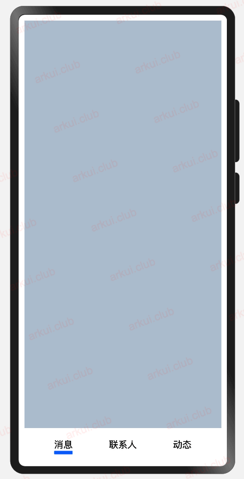
- barPosition: BarPosition.End
Tabs({
  barPosition: BarPosition.End, // 设置Tab在下方
  controller: this.controller
}) {
  TabContent() {
    Column()
      .width('100%')
      .height('100%')
      .backgroundColor("#aabbcc")
  }
  .tabBar("消息")

  TabContent() {
    Column()
      .width('100%')
      .height('100%')
      .backgroundColor("#bbccaa")
  }
  .tabBar("联系人")

  TabContent() {
    Column()
      .width('100%')
      .height('100%')
      .backgroundColor("#ccaabb")
  }
  .tabBar("动态")
}
.vertical(false)样例运行结果如下图所示:
- vertical 设置为 true:
- barPosition: BarPosition.Start
简单样例如下所示:
Tabs({
  barPosition: BarPosition.Start, // 设置Tab在左侧
  controller: this.controller
}) {
  TabContent() {
    Column()
      .width('100%')
      .height('100%')
      .backgroundColor("#aabbcc")
  }
  .tabBar("消息")

  TabContent() {
    Column()
      .width('100%')
      .height('100%')
      .backgroundColor("#bbccaa")
  }
  .tabBar("联系人")

  TabContent() {
    Column()
      .width('100%')
      .height('100%')
      .backgroundColor("#ccaabb")
  }
  .tabBar("动态")
}
.width('100%')
.height('100%')
.barWidth(80)
.barHeight(150)
.vertical(true)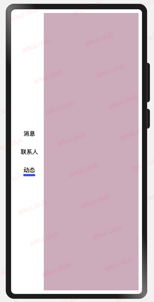
- barPosition: BarPosition.End
Tabs({
  barPosition: BarPosition.End, // 设置Tab在右侧
  controller: this.controller
}) {
  TabContent() {
    Column()
      .width('100%')
      .height('100%')
      .backgroundColor("#aabbcc")
  }
  .tabBar("消息")

  TabContent() {
    Column()
      .width('100%')
      .height('100%')
      .backgroundColor("#bbccaa")
  }
  .tabBar("联系人")

  TabContent() {
    Column()
      .width('100%')
      .height('100%')
      .backgroundColor("#ccaabb")
  }
  .tabBar("动态")
}
.width('100%')
.height('100%')
.barWidth(80)
.barHeight(150)
.vertical(true)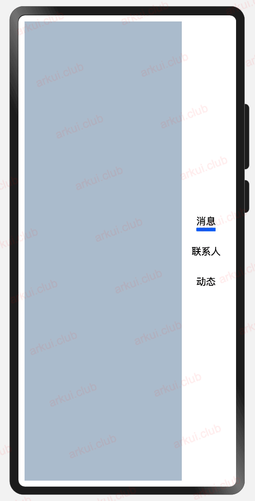
scrollable:是否可以通过滑动进行页面切换,默认为 true ,表示可以滑动切换页面。
barMode:设置 TabBar 的布局模式, TabBar 的类型说明如下:
Scrollable: TabBar 使用实际布局宽度, 超过总长度后可滑动。
Fixed:所有 TabBar 平均分配宽度。
barWidth:设置 TabBar 的宽度值,不设置时使用系统主题中的默认值。
barHeight:设置 TabBar 的高度值,不设置时使用系统主题中的默认值。
animationDuration:设置 TabContent 滑动动画时长,默认值为 200 。
Tabs 事件介绍
declare class TabsAttribute extends CommonMethod<TabsAttribute> {
  onChange(event: (index: number) => void): TabsAttribute;
}- onChange: Tabs 页签切换后触发的事件, index 表示当前页签下标。
TabContent 定义介绍
interface TabContentInterface {
  (): TabContentAttribute;
}由源码可知, TabContent 目前不需要配置默认参数。
TabContent 属性介绍
declare class TabContentAttribute extends CommonMethod<TabContentAttribute> {
  tabBar(value: string | Resource | CustomBuilder |
    { icon?: string | Resource; text?: string | Resource }): TabContentAttribute;
}- tabBar:设置 TabBar 的显示标签,根据源码可知,tabBar 参数类型支持多种数据类型:
string | Resource:直接使用文本,样式使用系统自带的。
{ icon?: string | Resource; text?: string | Resource }:
icon:设置标签的图标。
text:设置标签的文本。
- CustomBuilder:自定义 TabBar 标签
Tabs 完整样例
@Entry @Component struct TabsTest {

  private controller: TabsController = new TabsController();

  @State index: number = 0; // 选项卡下标,默认为第一个

  @Builder tabMessage() {   // 自定义消息标签
    Column() {
      Column() {
        Blank()
        Image(this.index == 0 ? 'pages/icon_message_selected.png' : 'pages/icon_message_normal.png')
          .size({width: 25, height: 25})
        Text('消息')
          .fontSize(16)
          .fontColor(this.index == 0 ? "#2a58d0" : "#6b6b6b")
        Blank()
      }
      .height('100%')
      .width("100%")
      .onClick(() => {
        this.index = 0;
        this.controller.changeIndex(this.index);
      })
    }
  }

  @Builder tabContract() {  // 自定义联系人标签
    Column() {
      Blank()
      Image(this.index == 1 ? 'pages/icon_contract_selected.png' : 'pages/icon_contract_normal.png')
        .size({width: 25, height: 25})
      Text('联系人')
        .fontSize(16)
        .fontColor(this.index == 1 ? "#2a58d0" : "#6b6b6b")
      Blank()
    }
    .height('100%')
    .width("100%")
    .onClick(() => {
      this.index = 1;
      this.controller.changeIndex(this.index);
    })
  }

  @Builder tabDynamic() {   // 自定义动态标签
    Column() {
      Blank()
      Image(this.index == 2 ? 'pages/icon_dynamic_selected.png' : 'pages/icon_dynamic_normal.png')
        .size({width: 25, height: 25})
      Text('动态')
        .fontSize(16)
        .fontColor(this.index == 2 ? "#2a58d0" : "#6b6b6b")
      Blank()
    }
    .height('100%')
    .width("100%")
    .onClick(() => {
      this.index = 2;
      this.controller.changeIndex(this.index);
    })
  }

  build() {
    Column() {
      Tabs({
        barPosition: BarPosition.End, // TabBar排列在下方
        controller: this.controller   // 绑定控制器
      }) {
        TabContent() {
          Column() {
            Text('消息')
              .fontSize(30)
          }
          .width('100%')
          .height('100%')
          .backgroundColor("#aabbcc")
        }
        .tabBar(this.tabMessage)      // 使用自定义TabBar

        TabContent() {
          Column() {
            Text('联系人')
              .fontSize(30)
          }
          .width('100%')
          .height('100%')
          .backgroundColor("#bbccaa")
        }
        .tabBar(this.tabContract)     // 使用自定义TabBar

        TabContent() {
          Column() {
            Text('动态')
              .fontSize(30)
          }
          .width('100%')
          .height('100%')
          .backgroundColor("#ccaabb")
        }
        .tabBar(this.tabDynamic)      // 使用自定义TabBar
      }
      .width('100%')
      .height('100%')
      .barHeight(60)
      .barMode(BarMode.Fixed)         // TabBar均分
      .onChange((index: number) => {  // 页面切换回调
        this.index = index;
      })
    }
    .width('100%')
    .height('100%')
  }
}样例运行结果如下图所示: