
按钮组件
Button 组件也是基础组件之一,和其它基础组件不同的是 Button 组件允许添加一个子组件来实现不同的展示样式。
Button 定义介绍
bash
interface ButtonInterface {
  (): ButtonAttribute;
  (options: ButtonOptions): ButtonAttribute;
  (label: ResourceStr, options?: ButtonOptions): ButtonAttribute;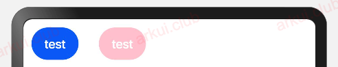
}label:设置按钮文字,简单样例如下所示:
bash
Button('test')

Button('test')
.backgroundColor(Color.Pink)样例运行结果如下图所示:
type
设置 Button 按钮的显示样式, ButtonType 定义了以下 3 种样式:
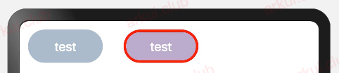
- Capsule(默认值):胶囊类型,圆角值为 Button 高度的一半并且不允许修改,此时通过设置 borderRadius() 的方式设置圆角则无效。简单样例如下所示:
bash
Button('test')
  .height(40)
  .width(90)
  .backgroundColor('#aabbcc')

Button('test', {type: ButtonType.Capsule})
  .height(40)
  .width(90)
  .borderRadius(20)          // 设置圆角,但是没有效果
  .borderWidth(3)            // 设置边框宽度
  .borderColor(Color.Red)    // 设置边框颜色
.backgroundColor('#bbaacc')// 设置背景色样例运行结果如下图所示:
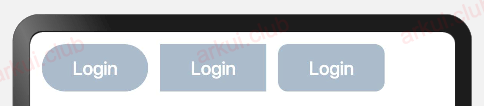
- Normal:矩形按钮,无圆角,可以通过 borderRadius() 设置圆角大小,不支持通过 border() 的方式设置圆角,简单样例如下所示:
bash
Button('Login')                            // 默认胶囊类型
  .height(40)
  .width(90)
  .backgroundColor('#aabbcc')

Button('Login', {type: ButtonType.Normal}) // 没有圆角
  .height(40)
  .width(90)
  .backgroundColor('#aabbcc')

Button('Login', {type: ButtonType.Normal}) // 设置圆角
  .height(40)
  .width(90)
  .backgroundColor('#aabbcc')
.borderRadius(8)样例运行结果如下图所示:
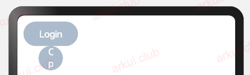
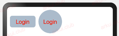
- Circle:圆形按钮,设置该样式时,简单样例如下所示:
bash
Button('Login')
  .height(40)
  .width(90)
  .backgroundColor('#aabbcc')

Button('Harmony', {type: ButtonType.Circle})
  .backgroundColor('#aabbcc')

Button('OpenHarmony', {type: ButtonType.Circle})
  .height(40)
  .width(90)
.backgroundColor('#aabbcc')样例运行结果如下图所示:
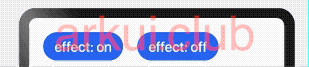
- stateEffect:设置是否开启点击效果,默认开启,简单样例如下所示:
bash
Button('effect: on')
  .fontSize(20)

Button('effect: off', {stateEffect: false})
.fontSize(20)样例运行结果如下图所示:
Button 自定义样式
包含 Text 组件
bash
Button({type: ButtonType.Normal}) {
  Text('Login')
    .fontSize(20)
    .fontColor(Color.Red)
    .padding({left: 20, right: 20})
}
.borderRadius(8)
.backgroundColor("#aabbcc")

Button({type: ButtonType.Circle}) {
  Text('Login')
    .fontSize(20)
    .fontColor(Color.Red)
}
.width(80)
.height(80)
.backgroundColor("#aabbcc")样例运行结果如下图所示:
样例给 Button 添加了一个 Text 子组件,通过设置 Text 的文本样式达到修改 Button 文字的效果。
包含 Image 组件
bash
Button({type: ButtonType.Circle}) {
  Image($r("app.media.more"))
    .width(30)
    .height(30)
}
.width(70)
.height(70)

Button({type: ButtonType.Circle}) {
  Image($r("app.media.delete"))
    .width(40)
    .height(40)
}
.width(70)
.height(70)
.backgroundColor('#ff0000')样例运行结果如下图所示:
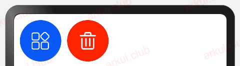
样例中使用了 Image 组件,该组件是后续章节要讲解的基础组件,读者们先了解一下。
包含复杂组件
bash
Button({type: ButtonType.Normal}) {
  Row() {
    Image($r("app.media.loading"))
      .width(30)
      .height(30)
      .margin({left: 12})
    Text('loading')
      .fontSize(20)
      .fontColor('#ffffff')
      .margin({left: 5, right: 12})
  }
}
.borderRadius(8)
.backgroundColor(0x317aff)样例运行结果如下图所示:
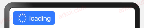
样例中使用 Row 作为子组件, Row 组件属于线性容器组件,它可以添加多个子组件,后续章节我们会详细介绍,读者们先知道这样用就可以了。