
页面导航(Navigation)
Navigation 组件一般作为页面布局的根容器,它提供了一系列属性方法来设置页面的标题栏、工具栏以及菜单栏的各种展示样式。 Navigation 除了提供了默认的展示样式属性外,它还提供了 CustomBuilder 模式来自定义展示样式,本节将介绍一下 Navigation 各属性的简单用法以及使用 CustomBuilder 实现自定义样式。
Navigation 定义介绍
interface NavigationInterface {
  (): NavigationAttribute;
}Navigation 的定义不需要传递相关参数,我们先看下 Navigation 的最简单样例:
Navigation() {                         // Navigation只能包含一个子组件
  Text('title')
    .textAlign(TextAlign.Center)
    .fontSize(30)
    .width('100%')
    .backgroundColor('#aabbcc')
}
.size({width: '100%', height: '100%'}) // Navigation只设置了size,没有设置任何其它属性样例运行结果如下图所示:
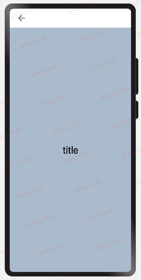
由运行结果可知,在默认情况下, Navigation 的样式是一个带有返回箭头的标题栏加子控件组成的。
Navigation 属性介绍
declare class NavigationAttribute extends CommonMethod<NavigationAttribute> {
  title(value: string | CustomBuilder): NavigationAttribute;
  subTitle(value: string): NavigationAttribute;
  hideTitleBar(value: boolean): NavigationAttribute;
  hideBackButton(value: boolean): NavigationAttribute;
  titleMode(value: NavigationTitleMode): NavigationAttribute;
  menus(value: Array<NavigationMenuItem> | CustomBuilder): NavigationAttribute;
  toolBar(value: object | CustomBuilder): NavigationAttribute;
  hideToolBar(value: boolean): NavigationAttribute;
  onTitleModeChange(callback: (titleMode: NavigationTitleMode) => void): NavigationAttribute;
}title:
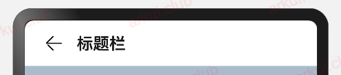
设置导航栏的标题,当参数类型为 string 时,可以直接设置标题,但样式不支修改;当参数为 CustomBuilder 时,可以自定义标题样式。
- 参数类型为 string ,简单样例如下所示:
Navigation() {
  Text('title')
    .textAlign(TextAlign.Center)
    .fontSize(30)
    .size({width: '100%', height: '100%'})
    .backgroundColor('#aabbcc')
}
.size({width: '100%', height: '100%'})
.title("标题栏")// 设置title,此时不支持修改文字大小,颜色等样式样例运行结果如下图所示:
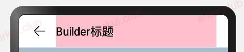
- 参数类型为 CustomBuilder ,简单样例如下所示:
@Entry @Component struct ComponentTest {

  @Builder title() {// 通过Builder自定义标题栏,可以灵活的设置标题样式
    Row() {
      Text('Builder标题')
        .fontSize(20)
    }
    .width('100%')
    .height(55)
    .backgroundColor(Color.Pink)
  }

  build() {
    Navigation() {
      Text('title')
        .textAlign(TextAlign.Center)
        .fontSize(30)
        .size({width: '100%', height: '100%'})
        .backgroundColor('#aabbcc')
    }
    .size({width: '100%', height: '100%'})
    .title(this.title())// 使用自定义的标题栏
  }
}样例运行结果如下图所示:
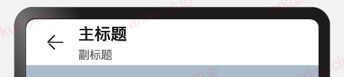
subTitle:
设置页面的副标题,简单样例如下所示:
Navigation() {
Text('title')
.textAlign(TextAlign.Center)
.fontSize(30)
.size({width: '100%', height: '100%'})
.backgroundColor('#aabbcc')
}
.size({width: '100%', height: '100%'})
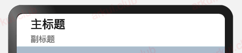
.title("主标题")
.subTitle("副标题")样例运行结果如下图所示:
hideBackButton:
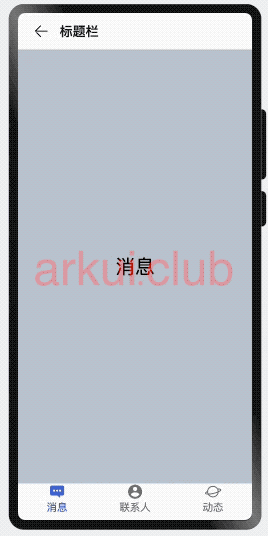
是否隐藏返回按钮,默认情况下不隐藏,简单样例如下所示:
Navigation() {
  Text('title')
    .textAlign(TextAlign.Center)
    .fontSize(30)
    .size({width: '100%', height: '100%'})
    .backgroundColor('#aabbcc')
}
.size({width: '100%', height: '100%'})
.title("主标题")
.subTitle("副标题")
.hideBackButton(true)样例运行结果如下图所示:
toolBar:
设置工具栏,当参数类型为 object 时,可以直接设置工具栏选项,但样式不支修改;当参数为 CustomBuilder 时,可以自定义标题栏。
当参数为 object 类型时,参数需要按照如下格式定义:
value:工具栏单个选项的显示文本。
icon:工具栏单个选项的图标资源路径。
action:当前选项被选中时的事件回调。
简单样例如下所示:
build() {
Navigation() {
Text('title')
.textAlign(TextAlign.Center)
.fontSize(30)
.size({width: '100%', height: '100%'})
.backgroundColor('#aabbcc')
}
.size({width: '100%', height: '100%'})
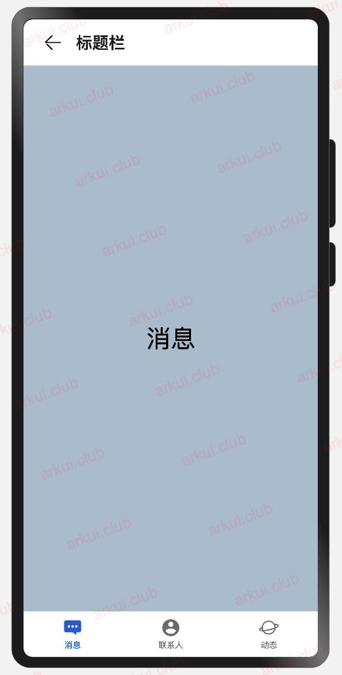
.title("标题栏")
.toolBar({ items: [ // toolBar接收一个数组
{
value: "消息", // 文本
icon: "pages/icon_message.png", // 图片
action: () => { // 事件
console.log("点击了消息")
}
},
{
value: "联系人",
icon: "pages/icon_contract.png",
action: () => {
console.log("点击了首页")
}
},
{
value: "动态",
icon: "pages/icon_dynamic.png",
action: () => {
console.log("点击了首页")
}
}
]})
}样例运行结果如下图所示:
- 当参数为 CustomBuilder 类型时,可以自定义样式,简单样例如下所示:
@Entry @Component struct ComponentTest {

  @State index: number = 0;// 选项卡下标,默认为第一个

  @Builder toolbar() {// 通过builder自定义toolbar
    Row() {
      Column() {
        Image(this.index == 0 ? 'pages/icon_message_selected.png' : 'pages/icon_message_normal.png')
          .size({width: 25, height: 25})
        Text('消息')
          .fontSize(16)
          .fontColor(this.index == 0 ? "#2a58d0" : "#6b6b6b")
      }
      .alignItems(HorizontalAlign.Center)
      .height('100%')
      .layoutWeight(1)
      .onClick(() => {
        this.index = 0;
      })

      Column() {
        Image(this.index == 1 ? 'pages/icon_contract_selected.png' : 'pages/icon_contract_normal.png')
          .size({width: 25, height: 25})
        Text('联系人')
          .fontSize(16)
          .fontColor(this.index == 1 ? "#2a58d0" : "#6b6b6b")
      }
      .alignItems(HorizontalAlign.Center)
      .height('100%')
      .layoutWeight(1)
      .onClick(() => {
        this.index = 1;
      })

      Column() {
        Image(this.index == 2 ? 'pages/icon_dynamic_selected.png' : 'pages/icon_dynamic_normal.png')
          .size({width: 25, height: 25})
        Text('动态')
          .fontSize(16)
          .fontColor(this.index == 2 ? "#2a58d0" : "#6b6b6b")
      }
      .alignItems(HorizontalAlign.Center)
      .height('100%')
      .layoutWeight(1)
      .onClick(() => {
        this.index = 2;
      })
    }
    .width('100%')
    .height(60)
  }

  build() {
    Navigation() {
      Text(this.index == 0 ? "消息" : this.index == 1 ? "联系人" : "动态")
        .textAlign(TextAlign.Center)
        .fontSize(30)
        .size({width: '100%', height: '100%'})
        .backgroundColor('#aabbcc')
    }
    .size({width: '100%', height: '100%'})
    .title("标题栏")
    .toolBar(this.toolbar())
  }
}样例运行结果如下图所示:
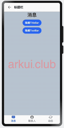
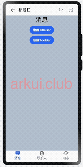
hideTitleBar、hideToolBar:
设置是否显示或者隐藏标题栏、工具栏,简单样例如下所示:
@Entry @Component struct ComponentTest {

  @State index: number = 0;
  @State hideToolBar: boolean = false;
  @State hideTitleBar: boolean = false;

  @Builder toolbar() {
    Row() {
      Column() {
        Image(this.index == 0 ? 'pages/icon_message_selected.png' : 'pages/icon_message_normal.png')
          .size({width: 25, height: 25})
        Text('消息')
          .fontSize(16)
          .fontColor(this.index == 0 ? "#2a58d0" : "#6b6b6b")
      }
      .alignItems(HorizontalAlign.Center)
      .height('100%')
      .layoutWeight(1)
      .onClick(() => {
        this.index = 0;
      })

      Column() {
        Image(this.index == 1 ? 'pages/icon_contract_selected.png' : 'pages/icon_contract_normal.png')
          .size({width: 25, height: 25})
        Text('联系人')
          .fontSize(16)
          .fontColor(this.index == 1 ? "#2a58d0" : "#6b6b6b")
      }
      .alignItems(HorizontalAlign.Center)
      .height('100%')
      .layoutWeight(1)
      .onClick(() => {
        this.index = 1;
      })

      Column() {
        Image(this.index == 2 ? 'pages/icon_dynamic_selected.png' : 'pages/icon_dynamic_normal.png')
          .size({width: 25, height: 25})
        Text('动态')
          .fontSize(16)
          .fontColor(this.index == 2 ? "#2a58d0" : "#6b6b6b")
      }
      .alignItems(HorizontalAlign.Center)
      .height('100%')
      .layoutWeight(1)
      .onClick(() => {
        this.index = 2;
      })
    }
    .width('100%')
    .height(60)
  }

  build() {
    Navigation() {
      Column({space: 10}) {
        Text(this.index == 0 ? "消息" : this.index == 1 ? "联系人" : "动态")
          .textAlign(TextAlign.Center)
          .fontSize(30)

        Button(this.hideTitleBar ? "显示TitleBar" : "隐藏TitleBar")
          .onClick(() => {
            this.hideTitleBar = !this.hideTitleBar;
          })


        Button(this.hideToolBar ? "显示ToolBar" : "隐藏ToolBar")
          .onClick(() => {
            this.hideToolBar = !this.hideToolBar;
          })
      }
      .backgroundColor('#aabbcc')
      .size({width: '100%', height: '100%'})
    }
    .size({width: '100%', height: '100%'})
    .title("标题栏")
    .toolBar(this.toolbar())
    .hideToolBar(this.hideToolBar)
    .hideTitleBar(this.hideTitleBar)
  }
}样例运行结果如下图所示:
menus:
设置标题栏右上角的菜单项,当参数为 CustomBuilder 时可以自定义菜单项。
- 当参数为 NavigationMenuItem 数组时,参数说明如下:
value:菜单项的显示文本。
icon:菜单项的显示图标路径。
action:点击菜单项的事件回调。
简单样例如下所示:
@Entry @Component struct ComponentTest {

  @State index: number = 0;
  @State hideToolBar: boolean = false;
  @State hideTitleBar: boolean = false;

  @Builder toolbar() {
    Row() {
      Column() {
        Image(this.index == 0 ? 'pages/icon_message_selected.png' : 'pages/icon_message_normal.png')
          .size({width: 25, height: 25})
        Text('消息')
          .fontSize(16)
          .fontColor(this.index == 0 ? "#2a58d0" : "#6b6b6b")
      }
      .alignItems(HorizontalAlign.Center)
      .height('100%')
      .layoutWeight(1)
      .onClick(() => {
        this.index = 0;
      })

      Column() {
        Image(this.index == 1 ? 'pages/icon_contract_selected.png' : 'pages/icon_contract_normal.png')
          .size({width: 25, height: 25})
        Text('联系人')
          .fontSize(16)
          .fontColor(this.index == 1 ? "#2a58d0" : "#6b6b6b")
      }
      .alignItems(HorizontalAlign.Center)
      .height('100%')
      .layoutWeight(1)
      .onClick(() => {
        this.index = 1;
      })

      Column() {
        Image(this.index == 2 ? 'pages/icon_dynamic_selected.png' : 'pages/icon_dynamic_normal.png')
          .size({width: 25, height: 25})
        Text('动态')
          .fontSize(16)
          .fontColor(this.index == 2 ? "#2a58d0" : "#6b6b6b")
      }
      .alignItems(HorizontalAlign.Center)
      .height('100%')
      .layoutWeight(1)
      .onClick(() => {
        this.index = 2;
      })
    }
    .width('100%')
    .height(60)
  }

  build() {
    Navigation() {
      Column({space: 10}) {
        Text(this.index == 0 ? "消息" : this.index == 1 ? "联系人" : "动态")
          .textAlign(TextAlign.Center)
          .fontSize(30)

        Button(this.hideTitleBar ? "显示TitleBar" : "隐藏TitleBar")
          .onClick(() => {
            this.hideTitleBar = !this.hideTitleBar;
          })


        Button(this.hideToolBar ? "显示ToolBar" : "隐藏ToolBar")
          .onClick(() => {
            this.hideToolBar = !this.hideToolBar;
          })
      }
      .backgroundColor('#aabbcc')
      .size({width: '100%', height: '100%'})
    }
    .size({width: '100%', height: '100%'})
    .title("标题栏")
    .toolBar(this.toolbar())
    .hideToolBar(this.hideToolBar)
    .hideTitleBar(this.hideTitleBar)
    .menus([
      {
        value: "搜索",
        icon: "pages/icon_search.png",
        action: () => {
          prompt.showToast({message: "搜索"})
        }
      },
      {
        value: "扫码",
        icon: "pages/icon_scan.png",
        action: () => {
          prompt.showToast({message: "扫码"})
        }
      }
    ])
  }
}样例运行结果如下图所示:
Navigation 事件介绍
declare class NavigationAttribute extends CommonMethod<NavigationAttribute> {
  onTitleModeChange(callback: (titleMode: NavigationTitleMode) => void): NavigationAttribute;
}onTitleModeChange:
当 titleMode 为 NavigationTitleMode.Free 时,随着可滚动组件的滑动标题栏模式发生变化时触发此回调。