滚动 List 组件
List 是很常用的滚动类容器组件之一,它按照水平或者竖直方向线性排列子组件, List 的子组件必须是 ListItem ,它的宽度默认充满 List 的宽度。
List 定义介绍
interface ListInterface {
  (value?: { initialIndex?: number; space?: number | string; scroller?: Scroller }): ListAttribute;
}initialIndex:默认值为 0 ,设置 List 第一次加载数据时所要显示的第一个子组件的下标,如果超过最后一个子组件的下标,则设置不生效。
space:设置列表间的间隔距离。
scroller:设置滚动控制器。(控制滚动到具体位置具体看完整案例代码)
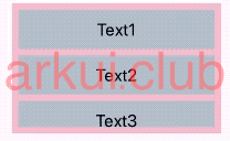
简单样例如下所示:
List({space: 10}) {                       // 设置ListItem之间的间隔为10
  ListItem() {                            // List的子组件只能是ListItem
    Text('Text1')
      .size({width: '100%', height: 60})
      .fontSize(26)
      .backgroundColor('#aabbcc')
  }
  .width('100%')

  ListItem() {                            // List的子组件只能是ListItem
    Text('Text2')
      .size({width: '100%', height: 60})
      .fontSize(26)
      .backgroundColor('#aabbcc')
  }
  .width('100%')

  ListItem() {                            // List的子组件只能是ListItem
    Text('Text3')
      .size({width: '100%', height: 60})
      .fontSize(26)
      .backgroundColor('#aabbcc')
  }
  .width('100%')

  ListItem() {                            // List的子组件只能是ListItem
    Text('Text4')
      .size({width: '100%', height: 60})
      .fontSize(26)
      .backgroundColor('#aabbcc')
  }
  .width('100%')

  ListItem() {                            // List的子组件只能是ListItem
    Text('Text5')
      .size({width: '100%', height: 60})
      .fontSize(26)
      .backgroundColor('#aabbcc')
  }
  .width('100%')
}
.width('100%')
.height(200)
.padding(10)
.backgroundColor(Color.Pink)样例运行结果如下图所示:
List 属性介绍
declare class ListAttribute<T> extends CommonMethod<T> {
  sticky(value: StickyStyle): T;
  listDirection(value: Axis): T;
  scrollBar(value: BarState): T;
  edgeEffect(value: EdgeEffect): T;
  divider(
    value: {
      strokeWidth: number | string | Resource;
      color?: Color | number | string | Resource;
      startMargin?: number | string | Resource;
      endMargin?: number | string | Resource;
    } | null
  ): T;
  editMode(value: boolean): T;
  cachedCount(value: number): T;
  chainAnimation(value: boolean): T;
}sticky
粘性定位 用来设置 List 的子组件是否需要粘性定位, StickyStyle 定义了以下 2 种粘性定位:
Header 设置头部固定定位
Footer: 设置尾部固定定位
None: 不设置粘性定位
listDirection:
设置子组件的排列方向, Axis 定义了以下 2 种排列方向:
Vertical(默认值):设置子组件竖直方向排列
Horizontal:设置子组件水平方向排列
edgeEffect:
设置 List 滑动到边缘时的滑动效果, EdgeEffect 定义了以下 2 种滑动效果:
Spring(默认值):弹性物理动效,滑动到边缘后可以根据初始速度或通过触摸事件继续滑动一段距离,松手后回弹。
None:没有滑动效果。
Fade: 阴影效果 滑动到边缘后会有圆弧状的阴影
divider:
设置分割线样式,默认无分割线,分割线样式说明如下:
strokeWidth:分割线的宽度
color:分割线的颜色
startMargin:分割线距离列表侧边起始端的距离。
endMargin:分割线距离列表侧边结束端的距离。
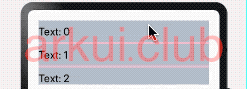
简单样例如下所示:
// private items: number[] = [0, 1, 2, 3, 4, 5, 6, 7, 8, 9, 10, 11, 12, 13, 14];
List() {// List默认竖直方向排列子组件
  ForEach(this.items, (item: any, index?: number) => {
    ListItem() {
      Text('Text: ' + item)
        .fontSize(20)
        .height(40)
        .backgroundColor("#aabbcc")
        .width('100%')
    }
  })
}
.height(120)
.width('100%')
.divider({
  strokeWidth: 4,   // 设置分割线宽度
  color: Color.Pink // 设置分割线颜色
})样例运行结果如下图所示:
editMode:设置 List 是否可编辑,默认不可编辑。
chainAnimation:时候开启联动效果,默认不开启。
scrollBar:设置滚动条状态,功能同 Scroll 。
cachedCount:设置 List 的缓存数量。
List 事件介绍
declare class ListAttribute<T> extends CommonMethod<T> {
  onScroll(event: (scrollOffset: number, scrollState: ScrollState) => void): T;
  onScrollIndex(event: (start: number, end: number) => void): T;
  onReachStart(event: () => void): T;
  onReachEnd(event: () => void): T;
  onScrollStop(event: () => void): T;
  onItemDelete(event: (index: number) => boolean): T;
  onItemMove(event: (from: number, to: number) => boolean): T;
}onItemDelete:列表项被删除时触发该回调。
onScrollIndex:当前列表显示的起始位置和终止位置发生变化时触发该回调。
onReachStart:滚动到顶部触发该回调。
onReachEnd:滚动到底部触发该回调
ListGroup 定义介绍
ListGroup 必须放在List里面, ListGroup里面只能放ListItem,定义如下:
interface ListItemGroupInterface {
  (options?: ListItemGroupOptions): ListItemGroupAttribute;
}ListItemGroup 属性介绍
declare interface ListItemGroupOptions {
  header?: CustomBuilder;
  headerComponent?: ComponentContent;
  footer?: CustomBuilder;
  footerComponent?: ComponentContent;
  space?: number | string;
  style?: ListItemGroupStyle;
}header
设置 ListItemGroup 头部 HTML 用 Builder 装饰的
说明:可以放单个或不放子 HTML
headerComponent
设置 ListItemGroup 头部组件用 Builder 装饰的
说明:可以放单个或不放子组件
footer
设置 ListItemGroup 底部 HTML 用 Builder 装饰的
说明:可以放单个或不放子 HTML
footerComponent
设置 ListItemGroup 底部组件用 component 装饰的
说明:可以放单个或不放子组件
space
设置 ListItemGroup 之间的间距
style
设置 ListItemGroup 的样式
举例
@Builder
function ItemBuilder(text: string) {
    Text(text)
        .fontSize(30)
        .fontColor(Color.Red)
        .textAlign(TextAlign.Start)
        .backgroundColor(Color.White)
        .zIndex(100)
        .width('100%')
}

List() {
    ForEach(this.ListData, (content: ListType, index) => {
        ListItemGroup({ header: ItemBuilder(content.name) }) {
            ForEach(content.children, (result: ListItemType, index) => {
                ListItem() {
                    Text(result.name).fontSize(30).fontColor(Color.Red)
                }.height(80)
            })
        }
    })
}ListItem 定义介绍
ListItem 用来展示 List 的具体 item,它的宽度默认充满 List 的宽度,它必须配合 List 使用才有效果,定义如下:
interface ListItemInterface {
  (value?: string): ListItemAttribute;
}value:标记位,标记当前 item 的 flag。
ListItem 属性介绍
declare class ListItemAttribute<T> extends CommonMethod<T> {
  sticky(value: Sticky): T;
  editable(value: boolean | EditMode): T;
}editable
是否可以编辑,进入编辑模式后可以删除 item ,默认为 false。
swipeAction
是否可以横向滑动后出现写好的组件
简单案例
简单样例如下所示:
List({space: 10}) {
  ListItem() {
    Text('Text1')
      .size({width: '100%', height: 60})
      .fontSize(26)
      .backgroundColor('#aabbcc')
  }
  .sticky(Sticky.Normal)// 设置吸顶效果
  .width('100%')

  ListItem() {
    Text('Text2')
      .size({width: '100%', height: 60})
      .fontSize(26)
      .backgroundColor('#aabbcc')
  }
  .width('100%')

  ListItem() {
    Text('Text3')
      .size({width: '100%', height: 60})
      .fontSize(26)
      .backgroundColor('#aabbcc')
  }
  .width('100%')

  ListItem() {
    Text('Text4')
      .size({width: '100%', height: 60})
      .fontSize(26)
      .backgroundColor('#aabbcc')
  }
  .width('100%')

  ListItem() {
    Text('Text5')
      .size({width: '100%', height: 60})
      .fontSize(26)
      .backgroundColor('#aabbcc')
  }
  .width('100%')
}
.width('100%')
.height(200)
.padding(10)
.backgroundColor(Color.Pink)样例运行结果如下图所示:

完整样例
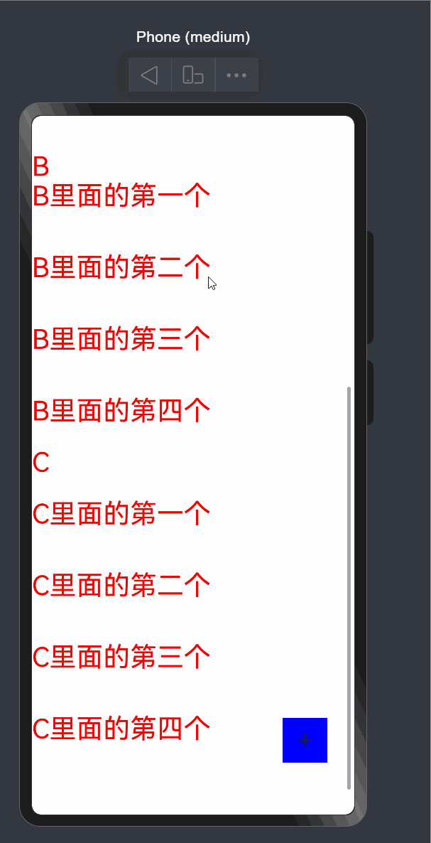
List 结合 ListItem 完整样例如下所示:
interface ListType {
    name: string,
    children?: ListItemType[]
}

interface ListItemType {
    name: string
}

@Builder
function ItemBuilder(text: string) {
    Text(text)
        .fontSize(30)
        .fontColor(Color.Red)
        .textAlign(TextAlign.Start)
        .backgroundColor(Color.White)
        .zIndex(100)
        .width('100%')
}


@Entry
@Component
struct Index6 {
    @State ListData: ListType[] = [
        {
            name: "A",
            children: [
                {
                    name: "A里面的第一个"
                },
                {
                    name: "A里面的第二个"
                },
                {
                    name: "A里面的第三个"
                },
                {
                    name: "A里面的第四个"
                }
            ]
        },
        {
            name: "B",
            children: [
                {
                    name: "B里面的第一个"
                },
                {
                    name: "B里面的第二个"
                },
                {
                    name: "B里面的第三个"
                },
                {
                    name: "B里面的第四个"
                }
            ]
        },
        {
            name: "C",
            children: [
                {
                    name: "C里面的第一个"
                },
                {
                    name: "C里面的第二个"
                },
                {
                    name: "C里面的第三个"
                },
                {
                    name: "C里面的第四个"
                }
            ]
        }
    ]
    private listScroller: Scroller = new Scroller();

    @Builder
    cehua(text: string) {
        Text(text)
            .fontSize(30)
            .fontColor(Color.Red)
            .textAlign(TextAlign.Start)
            .backgroundColor(Color.White)
            .zIndex(100)
            .width('100%')
    }

    build() {
        Stack({ alignContent: Alignment.BottomEnd }) {
            List({ scroller: this.listScroller }) {
                ForEach(this.ListData, (content: ListType, index) => {
                    ListItemGroup({ header: ItemBuilder(content.name) }) {
                        ForEach(content.children, (result: ListItemType, index) => {
                            ListItem() {
                                Text(result.name).fontSize(30).fontColor(Color.Red)
                            }.height(80).swipeAction({
                                end: {
                                    builder: () => {
                                        this.cehua("侧滑结果")
                                    }
                                }
                            })
                        })
                    }
                })
            }
            .sticky(StickyStyle.Header)
            .onScrollIndex((index: number) => {
                console.log(`滚动到了第` + index.toString() + "号元素")
            })
            .onReachStart(() => {
                console.log("滚动到了头部")
            })
            .onReachEnd(() => {
                console.log("滚动到了底部")
            })

            Text("+")
                .width(50)
                .height(50)
                .textAlign(TextAlign.Center)
                .fontSize(30)
                .backgroundColor(Color.Blue)
                .position({
                    right: 30,
                    bottom: 30
                })
                .onClick(() => {
                    this.listScroller.scrollToIndex(1)
                })
        }
    }
}样例运行结果如下图所示: