输入框组件
ArkUI 开发框架提供了 2 种类型的输入框: TextInput 和 TextArea ,前者只支持单行输入,后者支持多行输入,下面我们分别做下介绍。
TextInput 定义介绍
interface TextInputInterface {
  (value?: TextInputOptions): TextInputAttribute;
}

declare interface TextInputOptions {
  placeholder?: ResourceStr;
  text?: ResourceStr;
  controller?: TextInputController;
}value
输入框的提示样式设置, TextInputOptions 参数类型说明如下:
text:设置输入框的初始显示文本,不设置时显示 placeholder 的内容。
placeholder:占位提示文本,当不设置 text 是,显示该文本。
controller:光标控制器,设置光标的下标位置。
简单样例如下:
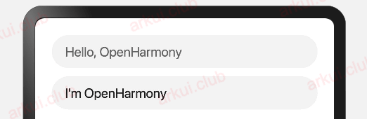
TextInput({
  placeholder: "Hello, OpenHarmony"
})

TextInput({
  placeholder: "Hello, OpenHarmony",
  text: "I'm OpenHarmony"
})样例运行结果如下图所示:
TextInput 属性介绍
declare class TextInputAttribute extends CommonMethod<TextInputAttribute> {
  type(value: InputType): TextInputAttribute;
  placeholderColor(value: ResourceColor): TextInputAttribute;
  placeholderFont(value?: Font): TextInputAttribute;
  enterKeyType(value: EnterKeyType): TextInputAttribute;
  caretColor(value: ResourceColor): TextInputAttribute;
  onEditChanged(callback: (isEditing: boolean) => void): TextInputAttribute;
  onEditChange(callback: (isEditing: boolean) => void): TextInputAttribute;
  onSubmit(callback: (enterKey: EnterKeyType) => void): TextInputAttribute;
  onChange(callback: (value: string) => void): TextInputAttribute;
  maxLength(value: number): TextInputAttribute;
  fontColor(value: ResourceColor): TextInputAttribute;
  fontSize(value: Length): TextInputAttribute;
  fontStyle(value: FontStyle): TextInputAttribute;
  fontWeight(value: number | FontWeight | string): TextInputAttribute;
  fontFamily(value: ResourceStr): TextInputAttribute;
  inputFilter(value: ResourceStr, error?: (value: string) => void): TextInputAttribute;
  onCopy(callback: (value: string) => void): TextInputAttribute;
  onCut(callback: (value: string) => void): TextInputAttribute;
  onPaste(callback: (value: string) => void): TextInputAttribute;
}TextInput 组件用于文本输入,它只能单行文本输入,若文本超出自身长度则使用 ... 在末尾替代。 TextInput 组件除了公共属性外,它还提供了很多常用的属性:
type:表示输入框的类型,比如设置为 Number ,则表示输入框只能输入数字。
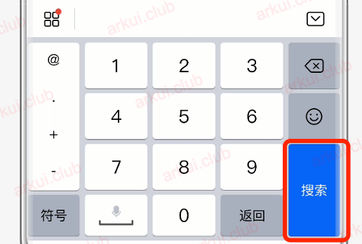
enterKeyType:表示设置输入法回车键类型,主要用来控制回车键的显示样式。
例如设置 enterKeyType 为 Search , type 为 Number 时,结果如下图所示:
maxLength:设置输入框允许输入多少字符。
caretColor:设置光标的颜色。
TextInput 事件介绍
declare class TextInputAttribute extends CommonMethod<TextInputAttribute> {
  onEditChanged(callback: (isEditing: boolean) => void): TextInputAttribute;
  onEditChange(callback: (isEditing: boolean) => void): TextInputAttribute;
  onSubmit(callback: (enterKey: EnterKeyType) => void): TextInputAttribute;
  onChange(callback: (value: string) => void): TextInputAttribute;
  onCopy(callback: (value: string) => void): TextInputAttribute;
  onCut(callback: (value: string) => void): TextInputAttribute;
  onPaste(callback: (value: string) => void): TextInputAttribute;
}TextInput 除了具有公共事件外,它还提供了自己独有的事件回调。
onChange:当输入框的内容变化时,触发该回调并把输入框的值回调出来
onSubmit:回车键或者软键盘回车键触发该回调,参数为当前软键盘回车键类型。
onEditChanged:输入状态变化时,触发回调。
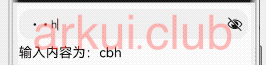
TextInput 的一个简单示例如下:
@Entry @Component struct ComponentTest {

  @State value: string = "";

  build() {
    Column() {
      TextInput({ placeholder: "请输入密码"})
        .width('100%')
        .height(45)
        .type(InputType.Password)
        .enterKeyType(EnterKeyType.Done)
        .caretColor(Color.Red)
        .placeholderColor(Color.Green)
        .placeholderFont({
          size: 20,
          style: FontStyle.Italic,
          weight: FontWeight.Bold
        })
        .onChange((value) => {
          this.value = value;
        })

      Text("输入内容为:" + this.value)
        .fontSize(20)
        .width('100%')
        .margin({top: 5})

    }
    .alignItems(HorizontalAlign.Center)
    .width('100%')
    .height(('100%'))
    .padding(10)
}样例运行结果如下图所示:
TextArea 简单介绍
TextArea 和 TextInput 都属于输入框,只是 TextArea 允许多行输入,它们的属性也都大致是一样的,只是目前 TextArea 还不支持 maxLength 属性,这里就不再介绍 TextArea 的属性了。
完整样例演示
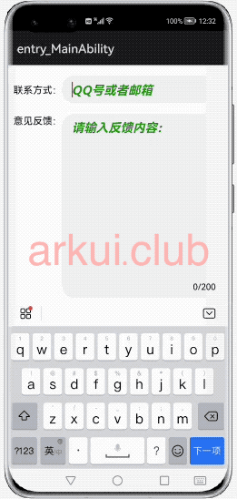
我们用一个简单的样例演示一下 TextInput 和 TextArea 的使用,如下所示:
@Entry @Component struct ComponentTest {

  @State value: string = "";

  build() {
    Column() {
      Row() {
        Text('联系方式:')
          .fontSize(16)

        TextInput({ placeholder: "QQ号或者邮箱"})
          .layoutWeight(1)
          .height(45)
          .type(InputType.Normal)
          .fontColor(Color.Brown)
          .enterKeyType(EnterKeyType.Next)
          .caretColor(Color.Red)
          .placeholderColor(Color.Green)
          .placeholderFont({
            size: 20,
            style: FontStyle.Italic,
            weight: FontWeight.Bold
          })
      }
      .width('100%')
      .height(60)

      Row() {
        Text('意见反馈:')
          .fontSize(16)

        Stack({alignContent: Alignment.BottomEnd}) {
          TextArea({ placeholder: "请输入反馈内容:"})
            .width("100%")
            .height(300)
            .fontColor(Color.Red)
            .fontStyle(FontStyle.Italic)
            .caretColor(Color.Red)
            .placeholderColor(Color.Green)
            .placeholderFont({
              size: 20,
              style: FontStyle.Italic,
              weight: FontWeight.Bold
            })
            .onChange((value) => {
              this.value = value;
            })

          Text(this.value.length + "/200")
            .fontSize(14)
            .margin(10)
        }
        .layoutWeight(1)
        .width('100%')
        .height(300)
      }
      .alignItems(VerticalAlign.Top)
      .width('100%')
      .height(300)
      .margin({top: 10})
    }
    .alignItems(HorizontalAlign.Center)
    .width('100%')
    .height(('100%'))
    .padding(10)
  }
}样例运行结果如下图所示: