公共提示类属性
ArkUI 开发框架提供了全局方法 bindMenu 和 bindPopup ,方便开发者合理利用弹窗选项给用户友好交互操作的体验,本节笔者介绍一下它们的简单使用
bindMenu
bindMenu 表示给当前组件绑定一个菜单项,用户点击组件后弹出菜单, bindMenu 定义如下:
declare class CommonMethod<T> {
  bindMenu(content: { value: string; action: () => void }[] | CustomBuilder): T;
}content 参数支持单项文本和自定义两种方式,这两种实现分别如下:
单项文本实现
当 content 类型为 { value: string; action: () => void } 时, value 表示要显示的菜单文本, action 表示点击该文本的事件回调,简单样例如下所示:
import promptAction from '@ohos.promptAction';
@Entry @Component struct Index {
  build() {
    Column({space: 10}) {
      Button("bindMenu")
        .width(120)
        .height(50)
        .onClick(() => {
          promptAction.showToast({message: "bindMenu",duration:3000,bottom:100})
        })
        .bindMenu([
          {
            value: "菜单1",
            action: () => {
              promptAction.showToast({message: "菜单1",duration:3000,bottom:100})
            }
          },
          {
            value: "菜单2",
            action: () => {
              promptAction.showToast({message: "菜单2",duration:3000,bottom:100})
            }
          },
          {
            value: "菜单3",
            action: () => {
              promptAction.showToast({message: "菜单3",duration:3000,bottom:100})
            }
          }
        ])
    }
    .padding(10)
    .size({ width: "100%", height: '100%' })
  }
}
从运行结果看,使用单项文本实现一个菜单,文字太小并且样式和布局均无法修改,这种方式 UI 局限性太大,为了满足多样式场景需求,ArkUI 开发框架提供了 CustomBuilder 方式允许开发者自定义 UI 描述。
CustomBuilder 方式实现
CustomBuilder 在 common.d.ts 文件中定义,源码定义如下:
declare type CustomBuilder = (() => any) | void;CustomBuilder 即可代表一个空类型也可以表示一个返回任意类型的函数,自定义 UI 描述使用 @Builder 装饰器装饰一个方法,该方法功能和语法规范和 build 函数相同,返回一个 UI 布局,格式如下所示:
@Builder function
function_name() { // @Builder修复一个方法
  // UI布局
  Column() {
  }
}用户自定义 UI 实现,就是使用 @Builder 修饰一个方法,该方法返回一个 UI 布局即可,简单样例如下所示
import promptAction from '@ohos.promptAction';

@Entry
@Component
struct Index {
  build() {
    Column({ space: 10 }) {
      Button("bindMenu")
        .width(120)
        .height(50)
        .onClick(() => {
          promptAction.showToast({ message: "bindMenu", duration: 3000, bottom: 100 })
        })
        .bindMenu(
          MenuList()
        )
    }
    .padding(10)
    .size({ width: "100%", height: '100%' })
  }
}

@Extend(Text)
function TextStyle() {
  .fontSize(24)
  .fontColor(Color.Red)
}

@Builder
function MenuList() {
  Column({ space: 20 }) {
    Row() {
      Text("张三").TextStyle()
    }.onClick(() => {
      promptAction.showToast({ message: "张三", duration: 3000, bottom: 100 });
    })

    Row() {
      Image($r("app.media.app_icon")).width(24).height(24)
      Text("游客头像").TextStyle().onClick(() => {
        promptAction.showToast({ message: "游客头像", duration: 3000, bottom: 100 });
      })
    }

    Row() {
      Image($r("app.media.app_icon")).width(24).height(24)
      Text("管理员头像").TextStyle().onClick(() => {
        promptAction.showToast({ message: "管理员头像", duration: 3000, bottom: 100 });
      })
    }
  }
}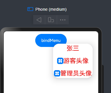
由样例可知, Button 同时设置了 onClick 和 bindMenu 方法, onClick 方法不起作用,对于这种场景,可以使用 bindContextMenu 方法代替。
bindContextMenu
这样就不会触发点击事件
该方法只有在长按或者右键点击组件是才会触发显示菜单项,这样就完美解决了和点击事件冲突的问题。 bindContextMenu 定义如下:
declare class CommonMethod<T> {
  bindContextMenu(content: CustomBuilder, responseType: ResponseType): T;
}content:参数只支持使用CustomBuilder自定义 UI 一种方式,responseType:触发弹窗的响应类型,ResponseType定义了一下两种类型:
LongPress: 通过长按触发菜单弹出。
RightClick:通过鼠标右键触发菜单弹出。
样例长按
import promptAction from '@ohos.promptAction';

@Entry
@Component
struct Index {
  build() {
    Column({ space: 10 }) {
      Button("bindMenu")
        .width(120)
        .height(50)
        .onClick(() => {
          promptAction.showToast({ message: "bindMenu", duration: 3000, bottom: 100 })
        })
        .bindContextMenu(
          MenuList(),
          ResponseType.LongPress
        )
    }
    .padding(10)
    .size({ width: "100%", height: '100%' })
  }
}

@Extend(Text)
function TextStyle() {
  .fontSize(24)
  .fontColor(Color.Red)
}

@Builder
function MenuList() {
  Column({ space: 20 }) {
    Row() {
      Text("张三").TextStyle()
    }.onClick(() => {
      promptAction.showToast({ message: "张三", duration: 3000, bottom: 100 });
    })

    Row() {
      Image($r("app.media.app_icon")).width(24).height(24)
      Text("游客头像").TextStyle().onClick(() => {
        promptAction.showToast({ message: "游客头像", duration: 3000, bottom: 100 });
      })
    }

    Row() {
      Image($r("app.media.app_icon")).width(24).height(24)
      Text("管理员头像").TextStyle().onClick(() => {
        promptAction.showToast({ message: "管理员头像", duration: 3000, bottom: 100 });
      })
    }
  }
}
bindPopup
bindPopup 和 bindMenu 功能类似,从用户角度讲都是弹出一个可选项提示框, bindPopup 定义如下:
declare class CommonMethod<T> {
  bindPopup(show: boolean, popup: PopupOptions | CustomPopupOptions): T;
}show:创建Popup弹窗时是否默认显示,默认值为false。popup:Popup的显示配置,参数支持PopupOptions和CustomPopupOptions两种类型,他们分别如下所示:
PopupOptions 配置如下:
declare interface PopupOptions {
  message: string;                                         // 显示的信息提示
  placementOnTop?: boolean;                                // 是否显示在组件上方,默认值为 false
  primaryButton?: {                                        // 第一个按钮的配置
    value: string;                                         // 按钮的文字
    action: () => void;                                    // 按钮的点击回调
  };
  secondaryButton?: {                                      // 第二个按钮的配置
    value: string;                                         // 按钮的文字
    action: () => void;                                    // 按钮的事件回调
  };
  onStateChange?: (event: { isVisible: boolean }) => void; // Popup可见性变化的回调
}message: Popup 显示的提示文字。
placementOnTop: Popup 是否显示在组件上方。
primaryButton: Popup 显示按钮配置。
secondaryButton: Popup 显示按钮配置。
onStateChange: Popup 可见性变化的回调。
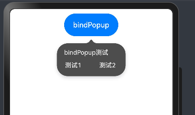
简单示例:
import promptAction from '@ohos.promptAction';

@Entry
@Component
struct Index {
  @State showPopup:boolean = false;
  build() {
    Column({ space: 10 }) {

      Button("bindPopup")
        .width(120)
        .height(50)
        .bindPopup(this.showPopup, {
          message: "bindPopup测试",
          placementOnTop: true,
          onStateChange: ((state) => {
            promptAction.showToast({message: "isVisible: " + state.isVisible})
          }),
          primaryButton: {
            value: "测试1",
            action: () => {
              promptAction.showToast({message: "测试1"})
              this.showPopup = !this.showPopup;
            }
          },
          secondaryButton: {
            value: "测试2",
            action: () => {
              promptAction.showToast({message: "测试2"})
              this.showPopup = !this.showPopup;
            }
          }
        })
        .onClick(() => {
          this.showPopup = !this.showPopup;
        })
    }
    .padding(10)
    .size({ width: "100%", height: '100%' })
  }
}
CustomPopupOptions 配置如下:
declare interface CustomPopupOptions {
  builder: CustomBuilder;
  placement?: Placement;
  maskColor?: Color | string | Resource | number;
  popupColor?: Color | string | Resource | number;
  enableArrow?: boolean;
  autoCancel?: boolean;
  onStateChange?: (event: { isVisible: boolean }) => void;
}builder:自定义 Popup 。
placement: Popup 的相对位置。
maskColor: Popup 蒙层颜色。
popupColor: Popup 背景颜色。
enableArrow: Popup 是否显示箭头。
autoCancel: Popup 是否自动隐藏。
onStateChange: Popup 可见性变化的回调。
简单样例如下所示:
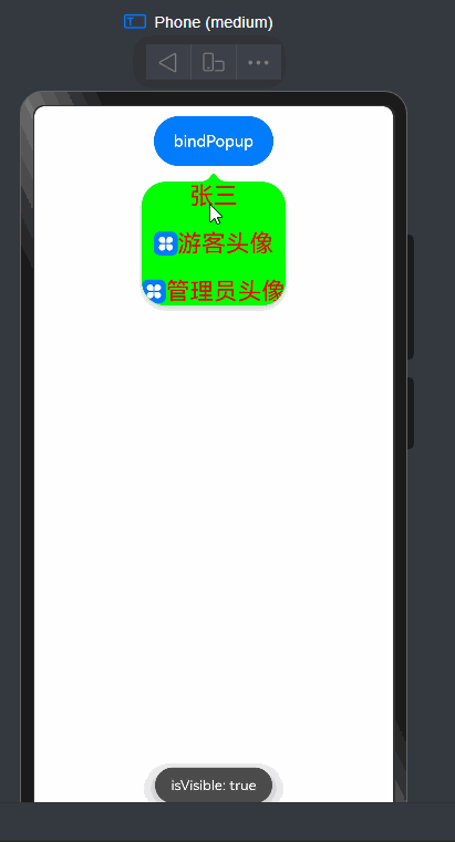
import promptAction from '@ohos.promptAction';

@Entry
@Component
struct Index {
  @State showPopup:boolean = false;
  build() {
    Column({ space: 10 }) {

      Button("bindPopup")
        .width(120)
        .height(50)
        .bindPopup(this.showPopup, {
          builder:MenuList(), // 自定义UI
          placement:Placement.Bottom, // 按钮下方显示
          maskColor:"black", // 蒙层颜色
          popupColor:"green", // 背景色
          enableArrow:true, // 是否显示箭头
          autoCancel:false, // 设置自动隐藏
          onStateChange: ((state) => {
            promptAction.showToast({message: "isVisible: " + state.isVisible})
          })
        })
        .onClick(() => {
          this.showPopup = !this.showPopup;
        })

    }
    .padding(10)
    .size({ width: "100%", height: '100%' })
  }
}

@Extend(Text)
function TextStyle() {
  .fontSize(24)
  .fontColor(Color.Red)
}

@Builder
function MenuList() {
  Column({ space: 20 }) {
    Row() {
      Text("张三").TextStyle()
    }.onClick(() => {
      this.showPopup = !this.showPopup;
      promptAction.showToast({ message: "张三", duration: 3000, bottom: 100 });
    })

    Row() {
      Image($r("app.media.app_icon")).width(24).height(24)
      Text("游客头像").TextStyle().onClick(() => {
        this.showPopup = !this.showPopup;
        promptAction.showToast({ message: "游客头像", duration: 3000, bottom: 100 });
      })
    }

    Row() {
      Image($r("app.media.app_icon")).width(24).height(24)
      Text("管理员头像").TextStyle().onClick(() => {
        this.showPopup = !this.showPopup;
        promptAction.showToast({ message: "管理员头像", duration: 3000, bottom: 100 });
      })
    }
  }
}