
公共事件类属性
上节笔者介绍了 ArkUI 开发框架组件的公共样式属性,本节笔者简单介绍一下组件的公共事件属性,读者也可自行查看 CommonMethod 的源码了解其它事件属性。
点击事件
export declare class CommonMethod<T> {
  onClick(event: (event?: ClickEvent) => void): T;
}onClick:给组件添加点击事件的回调,设置该回调后,当点击组件时会触发该回调。回调参数 event 包含了点击信息,比如点击坐标等。
简单样式例如下所示:
Text('Click AAA')
  .width(120)
  .height(40)
  .backgroundColor(Color.Pink)      // 设置背景颜色
  .onClick(() => {                  // 设置点击事件回调
    console.log("text clicked AAA") // 日志输出
})点击 Text 组件,控制台会打印 text clicked AAA 的日志。
触摸事件
export declare class CommonMethod<T> {
  onTouch(event: (event?: TouchEvent) => void): T;
}onTouch:给组件设置触摸事件的回调,设置该回调后,当触摸组件时会触发该回调。回调参数event包含了事件类型、点击坐标等信息。
简单样例如下:
Text('Click AAA')
  .width(120)
  .height(40)
  .backgroundColor(Color.Pink)
  .onTouch((event) => {                          // 设置触摸事件回调
    if(event.type == TouchType.Down) {           // 手指按下的事件回调
      console.log("touch down")
    } else if(event.type == TouchType.Move) {    // 手指移动的事件回调
      console.log("touch move")
    } else if(event.type == TouchType.Cancel) {  // 触摸事件取消时的事件回调
      console.log("touch cancel")
    } else if(event.type == TouchType.Up) {      // 手指抬起的事件回调
      console.log("touch up")
    }
})触摸该 Text 组件,控制台会打印如下日志。
[phone][Console   DEBUG]  03/15 00:05:47 88489984 app Log: touch down
[phone][Console   DEBUG]  03/15 00:05:47 88489984 app Log: touch move
[phone][Console   DEBUG]  03/15 00:05:47 88489984 app Log: touch move
[phone][Console   DEBUG]  03/15 00:05:48 88489984 app Log: touch move
[phone][Console DEBUG] 03/15 00:05:48 88489984 app Log: touch up拖拽事件
export declare class CommonMethod<T> {
  onDragStart(event: (event?: DragEvent, extraParams?: string) => CustomBuilder | DragItemInfo): T;
  onDragEnter(event: (event?: DragEvent, extraParams?: string) => void): T;
  onDragMove(event: (event?: DragEvent, extraParams?: string) => void): T;
  onDragLeave(event: (event?: DragEvent, extraParams?: string) => void): T;
  onDrop(event: (event?: DragEvent, extraParams?: string) => void): T;
}给组件设置拖拽事件的回调,设置该回调后,当拖拽组件动作发生时会触发相应的拖拽回调,各拖拽方法说明如下:
onDragStart:第一次拖拽此事件绑定的组件时,触发回调。参数event包含了拖拽坐标等信息,extraParams拖拽事件的额外信息。
INFO
长按 150 毫秒(ms)可触发拖拽事件。
优先级:长按手势配置时间小于等于 150 毫秒时,长按手势优先触发,否则拖拽事件优先触发。
onDragEnter:拖拽进入组件范围内时,触发回调。参数event包含了拖拽坐标等信息,extraParams拖拽事件的额外信息。
INFO
- 当监听了
onDrop事件的时候,此事件才有效
onDragMove:拖拽在组件范围内移动时,触发回调。参数event包含了拖拽坐标等信息,extraParams拖拽事件的额外信息。
INFO
- 当监听了 onDrop 事件时,此事件才有效。
onDragLeave:拖拽离开组件范围内时,触发回调。参数event包含了拖拽坐标等信息,extraParams拖拽事件的额外信息。
INFO
- 当监听了 onDrop 事件时,此事件才有效。
onDrop:绑定此事件的组件可作为拖拽释放目标,当在本组件范围内停止拖拽行为时,触发回调。参数event包含了拖拽坐标等信息,extraParams拖拽事件的额外信息。
简单案例如下:
@Entry
@Component
struct Index {
  @Builder
  example() {
    Column() {
      Text("拖动元素23232")
        .fontSize(30)
        .width(20)
        .height(20)
        .backgroundColor(Color.Yellow)
        .textAlign(TextAlign.Center)
    }
  }

  build() {
    Column() {
      Text("拖动元素")
        .fontSize(30)
        .width(200)
        .height(200)
        .backgroundColor(Color.Red)
        .textAlign(TextAlign.Center)
        .onDragStart((event: DragEvent, extraParams: string) => {
          return this.example()
        })
        .onDragMove((event: DragEvent, extraParams: string) => {
          console.log("拖动了" + event.getX())
        })
        .onDrop((event: DragEvent, extraParams: string) => {
          console.log("结束了" + event.getX())
        })
    }
    .width('100%')
    .height('100')

  }
}上面案例只有在文字上按住了,拖拽在红框内才会触发
挂载卸载事件
export declare class CommonMethod<T> {
  onAppear(event: () => void): T;
  onDisAppear(event: () => void): T;
}给组件设置挂载和卸载事件的回调,设置该回调后,当组件从组件树上挂载或者是卸载时会触发该回调。各 API 方法说明如下:
onAppear:组件从组件树上挂载的回调。
onDisAppear:组件从组件树上卸载的回调。
简单样例如下:
@Entry @Component struct Index {

  @State textShow: boolean = false; // 默认状态

  build() {
    Column() {
      Column() {
        if (this.textShow) {
          Text('挂载/卸载')
            .fontSize(22)
            .onAppear(() => {
              console.log("哈哈,我被挂载了")
            })
            .onDisAppear(() => {
              console.log("呜呜,我被卸载了")
            })
        }
      }
      .width('100%')
      .height(60)

      Button(this.textShow ? "卸载" : "挂载")
        .stateStyles({
          pressed: {
            .backgroundColor(Color.Pink) // 设置点击时的样式
          }
        })
        .onClick(() => { // 依次挂载卸载Text组件
          this.textShow = !this.textShow;
        })
    }
    .width('100%')
    .height('100%')
  }
}样例运行结果如下图所示:

日志打印
[phone][Console   DEBUG]  04/01 20:04:33 135208960 app Log: 哈哈,我被挂载了
[phone][Console   DEBUG]  04/01 20:04:35 135208960 app Log: 呜呜,我被卸载了
[phone][Console   DEBUG]  04/01 20:04:37 135208960 app Log: 哈哈,我被挂载了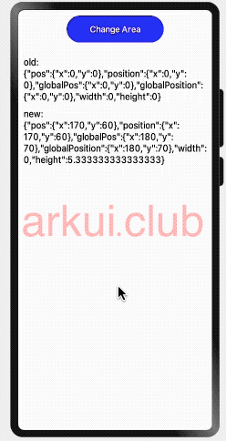
[phone][Console DEBUG] 04/01 20:04:39 135208960 app Log: 呜呜,我被卸载了区域变化事件
declare class CommonMethod<T> {
  // 区域变化的事件回调
  onAreaChange(event: (oldArea: Area, newArea: Area) => void): T;
}

declare interface Area {
  width: Length;            // 组件的宽度,单位为vp。
  height: Length;           // 组件的高度,单位为vp。
  position: Position;       // 组件左上角相对父组件左上角的位置。
  globalPosition: Position; // 组件左上角相对页面左上角的位置。
}组件区域发生变化会触发该回调,比如组件尺寸或者在屏幕上的位置发生改变都会触发该回调。
oldArea:组件变化前区域信息。
newArea:组件变化后区域信息。
@Styles function btnGlobalPressedStyle() { // 定义一个全局样式
  .backgroundColor(Color.Pink)
  .width(180)
  .height(50)
}

@Styles function btnGlobalNormalStyle() {  // 定义一个全局样式
  .backgroundColor(Color.Blue)
  .width(180)
  .height(50)
}

@Entry @Component struct Index {

  @State text: string = "";
  @State area: string = "";

  build() {
    Column({space: 10}) {

      Button("Change Area")
        .stateStyles({
          normal: btnGlobalNormalStyle,
          pressed: btnGlobalPressedStyle
        })
        .onClick(() => {
          this.text += "change ";
        })

      Text(this.text)
        .fontSize(18)
        .onAreaChange((oldArea, newArea) => {
          this.area = "old:\n" + JSON.stringify(oldArea) + "\n\n\nnew:\n" + JSON.stringify(newArea);
        })

      Text(this.area)
        .fontSize(18)
    }
    .width('100%')
    .height('100%')
    .padding(10)
  }
}样例运行结果如下所示:
焦点事件
declare class CommonMethod<T> {
  // 获取焦点的事件回调
  onFocus(event: () => void): T;
  // 失去焦点的事件回调
  onBlur(event: () => void): T;
}组件获取到焦点或者失去焦点时的事件回调,组件可使用焦点事件来更改内容。各方法说明如下:
onFocus:组件获取到焦点时的事件回调。
onBlur:组件失去焦点时的事件回调。
简单样例如下所示:
@Entry @Component struct ComponentTest {

  @State textOne: string = ''
  @State textTwo: string = ''
  @State textThree: string = ''
  @State oneButtonColor: string = '#FF0000'
  @State twoButtonColor: string = '#87CEFA'
  @State threeButtonColor: string = '#90EE90'

  build() {
    Column({ space: 10 }) {
      Button(this.textOne)
        .backgroundColor(this.oneButtonColor)
        .width(260)
        .height(70)
        .fontColor(Color.Black)
        .focusable(true)
        .onFocus(() => {
          this.textOne = 'First Button onFocus'
          this.oneButtonColor = '#AFEEEE'
        })
        .onBlur(() => {
          this.textOne = 'First Button onBlur'
          this.oneButtonColor = '#FFC0CB'
        })
      Button(this.textTwo)
        .backgroundColor(this.twoButtonColor)
        .width(260)
        .height(70)
        .fontColor(Color.Black)
        .focusable(true)
      Button(this.textThree)
        .backgroundColor(this.threeButtonColor)
        .width(260)
        .height(70)
        .fontColor(Color.Black)
        .focusable(true)
        .onFocus(() => {
          this.textThree = 'Third Button onFocus'
          this.threeButtonColor = '#AFEEEE'
        })
        .onBlur(() => {
          this.textThree = 'Third Button onBlur'
          this.threeButtonColor = '#FFC0CB'
        })
    }
    .width('100%')
    .height('100%')
    .padding(10)
  }
}样例运行结果如下图所示:
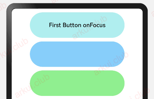
目前支持焦点事件的组件:Button、 Text、Image、 List、 Grid。
小结
本节简单介绍了组件的事件属性,事件属性在 APP 开发中不可或缺的,比如点击按钮跳转页面等,读者先简单了解事件属性的设置和用法即可,可后续对 ArkUI 框架的组件熟悉后可再回头观看本节内容。