
鸿蒙开发--组件公共属性
ArkUI 开发框架提供的基础组件直接或者间接的继承自 CommonMethod , CommonMethod 中定义的属性样式属于公共样式,本节笔者给大家介绍一下项目种最常用的部分样式属性,读者也可自行查看 CommonMethod 的源码了解其它样式属性。
尺寸设置
宽高设置
export declare class CommonMethod<T> {
  width(value: Length): T;
  height(value: Length): T;
  size(value: SizeOptions): T;
}设置组件的宽高,缺省时使用组件自身内容的宽高,比如充满父布局可以使用 string 值:"100%",当组件同时设置 size 和 width / height 时,以最后设置的值为准。
简单例子如下:
Text()
  .size({width: 220, height: 125}) // 设置宽高
  .width(120)                      // 设置宽度,覆盖前边的值
  .height(25)                      // 设置高度,覆盖前边的值
  .backgroundColor("#ccbbaa")      // 设置背景色

Text()
  .width("100%")                   // 设置宽度充满父布局
  .height(10)                      // 设置高度
  .backgroundColor(Color.Pink)     // 设置背景色

Text()
  .width(200)                      // 设置宽度
  .height(200)                     // 设置高度
  .size({width: 120, height: 25})  // 设置宽高,覆盖前边的值
.backgroundColor("#aabbcc") // 设置背景色运行结果如下图所示:
INFO
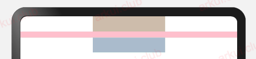
若子组件的宽高大于父组件的宽高,默认情况下子组件会绘制出父组件的可视范围,此时可以设置 clip(true) 方法限制子组件超出父组件的范围,样例如下所示:
Column() {
  Text("高超出父组件范围") // Text组件高超出父组件高度,则会绘制出父组件的范围
    .fontSize(25)
    .width(120)
    .height(120)
    .backgroundColor(Color.Pink)

}
.width(300)
.height(100)
.backgroundColor("#aabbcc")

Column() {
  Text("高超出父组件范围") // Text组件高超出父组件高度,则会绘制出父组件的范围
    .fontSize(25)
    .width(120)
    .height(120)
    .backgroundColor(Color.Pink)

}
.width(300)
.height(100)
.clip(true) // 设置父组件对于超出范围的子组件做剪切处理
.backgroundColor("#aabbcc")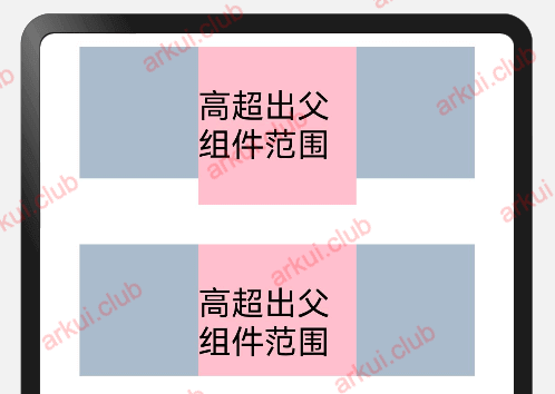
宽高比
export declare class CommonMethod<T> {
  aspectRatio(value: number): T;
}设置组件的宽高比:aspectRatio = width / height,在设备适配上比较实用。
简单样例如下所示:
@Entry
@Component
struct Index {

  build() {
    Column({space: 10}) {
      Row({space: 10}) {
        Text()
          .width(50)
          .height(50)
          .backgroundColor(Color.Pink) // 参考物,模拟1:1比例
        Text()
          .width(50)
          .backgroundColor(Color.Pink)
          .aspectRatio(1)              // 设置宽高比

        Text()
          .width(50)
          .backgroundColor(Color.Pink)
          .aspectRatio(1.5)            // 设置宽高比

        Text()
          .width(50)
          .height(50)
          .backgroundColor(Color.Pink)
          .aspectRatio(1.5)            // 设置宽高比

        Text()
          .width(50)
          .backgroundColor(Color.Pink)
          .aspectRatio(0.5)            // 设置宽高比
      }
      .width("100%")
      .height(120)
      .backgroundColor("#aabbcc")
    }
    .padding(10)
    .size({ width: "100%", height: '100%' })
  }
}
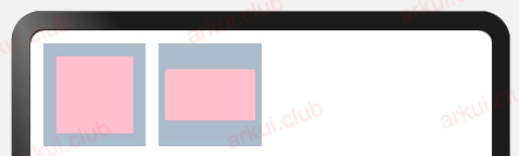
边距设置
export declare class CommonMethod<T> {
  padding(value: Padding | Length): T;
  margin(value: Margin | Length): T;
}设置组件的内边距/外边距,当只设置一个值时表示对四个方向的边距同时生效;参数类型为 Padding / Margin 时,可单独设置边距,若设置为百分比时,上下左右内外距均以父容器的 width 作为基础值。
简单样例如下所示:
Stack() {
  Text()
    .width('100%')               // 设置宽度充满父布局
    .height('100%')              // 设置高度充满父布局
    .backgroundColor(Color.Pink) // 设置背景色
}
.padding(10)                     // 设置四个边距值
.backgroundColor("#aabbcc")      // 设置背景色
.size({width: 80, height: 80})   // 设置宽高尺寸

Stack() {
  Text()
    .width('100%')               // 宽度充满父布局
    .height('100%')              // 高度充满父布局
    .backgroundColor(Color.Pink) // 设置背景色
}
.padding({left: 5, top: 20, right: 5, bottom: 20})// 设置不同的边距值
.backgroundColor("#aabbcc")                       // 设置背景色
.size({width: 80, height: 80}) // 设置宽高尺寸运行结果如下图所示:
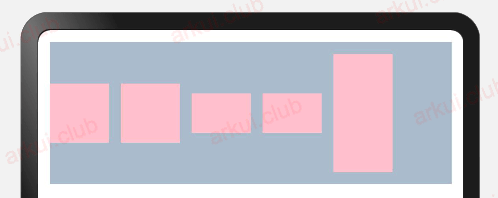
权重设置
export declare class CommonMethod<T> {
  layoutWeight(value: number | string): T;
}设置组件的布局权重,该属性仅在 Row、Column、Flex 布局中生效,表示在父容器主轴方向上的尺寸按照权重比进行分配,默认值为 0。
简单样例如下所示:
Row() { // 子组件全都设置了权重,则子组件的宽度按照权重比例分配
Text()
.height(30)
.backgroundColor("#aabbcc")
.layoutWeight(1)
Text()
.height(30)
.backgroundColor("#aaccbb")
.layoutWeight(1)
}
Row() { // 子组件全都设置了权重,则子组件的宽度按照权重比例分配,子组件设置的宽度无效
Text()
.width(20)
.height(30)
.backgroundColor("#aabbcc")
.layoutWeight(1)
Text()
.width(120)
.height(30)
.backgroundColor("#aaccbb")
.layoutWeight(1)
}
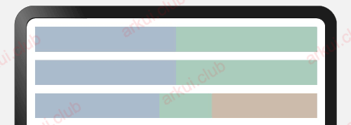
Row() { // 除去无权重子组件的宽度,剩余子组件的宽度按照权重比例分配
Text()
.width(150)
.height(30)
.backgroundColor("#aabbcc")
Text()
.height(30)
.backgroundColor("#aaccbb")
.layoutWeight(1)
Text()
.height(30)
.width(20)
.backgroundColor("#ccbbaa")
.layoutWeight(2)
}本样例中, Row 的每个子组件都设置了权重为 1 ,表示均分父组件的宽度,此时子组件设置的 width 是不起作用的,样例运行结果如下图所示:
尺寸约束(min,max)
export declare class CommonMethod<T> {
  constraintSize(value: ConstraintSizeOptions): T;
}

declare interface ConstraintSizeOptions {
    minWidth?: Length;
    maxWidth?: Length;
    minHeight?: Length;
    maxHeight?: Length;
}INFO
设置组件的约束尺寸从而在组件布局时对其尺寸进行限制, constraintSize() 的优先级高于 width() 和 height(), 若设置的 minWidth 大于 maxWidth, 则 minWidth 生效,minHeight 与 maxHeight 同理。
简单样例如下所示:
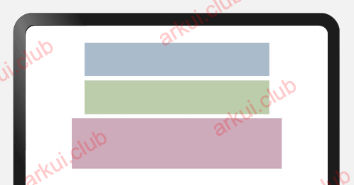
Text() // 目标参照组件
  .width(220)
  .height(40)
  .backgroundColor("#aabbcc")

Text() // 设置约束尺寸
  .width(220)
  .height(40)
  .constraintSize({
    minWidth: 120,
    minHeight: 20
  })
  .backgroundColor("#bbccaa")

Text() // 设置约束属性
  .width(220)
  .height(40)
  .constraintSize({
    minWidth: 250,
    minHeight: 60
  })
.backgroundColor("#ccaabb")运行结果如下图所示:
位置设置
对齐方式
declare class CommonMethod<T> {
  align(value: Alignment): T;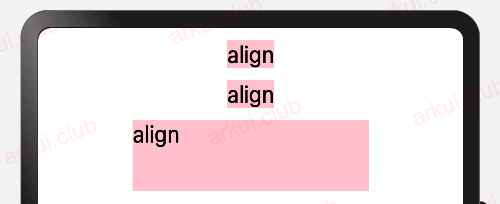
}设置元素内容的对齐方式,只有当设置的 width 和 height 大小超过元素本身内容大小时生效。
简单样例如下所示:
Column({ space: 10 }) {
  Text("align")                    // 默认样式
    .fontSize(20)
    .backgroundColor((Color.Pink))
  Text("align")                    // 组件尺寸默认等于内容尺寸
    .fontSize(20)
    .align(Alignment.TopStart)     // 组件尺寸默认等于内容尺寸,不符合条件
    .backgroundColor((Color.Pink))
  Text("align")
    .fontSize(20)
    .size({width: 200, height: 60})// 组件尺寸大于内容尺寸,符合条件
    .align(Alignment.TopStart)     // 设置内容对齐方式
    .backgroundColor((Color.Pink))
}
.width('100%')
.height("100%")
.padding(10)运行结果如下所示:
布局方向
- 定义
declare class CommonMethod<T> {
  direction(value: Direction): T;
}

declare enum Direction {
    Ltr,
    Rtl,
    Auto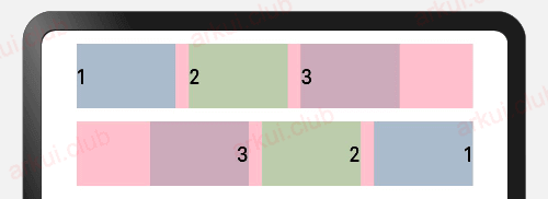
}设置子组件在水平方向上的布局方式,Direction 定义了一下 3 种布局方式:
- Ltr:元素从左到右布局。
- Rtl:元素从右到左布局。
- Auto(默认值):使用系统默认布局方向。
样例如下所示:
Column({ space: 10 }) {
  Row({space: 10}) { // 不设置子组件的对齐方式时采用默认值
    Text('1')
      .height(50)
      .width('25%')
      .fontSize(16)
      .backgroundColor("#aabbcc")
    Text('2')
      .height(50)
      .width('25%')
      .fontSize(16)
      .backgroundColor("#bbccaa")
    Text('3')
      .height(50)
      .width('25%')
      .fontSize(16)
      .backgroundColor("#ccaabb")
  }
  .width('90%')
  .backgroundColor(Color.Pink)

  Row({space: 10}) {
    Text('1')
      .height(50)
      .width('25%')
      .fontSize(16)
      .backgroundColor("#aabbcc")
    Text('2')
      .height(50)
      .width('25%')
      .fontSize(16)
      .backgroundColor("#bbccaa")
    Text('3')
      .height(50)
      .width('25%')
      .fontSize(16)
      .backgroundColor("#ccaabb")
  }
  .width('90%')
  .backgroundColor(Color.Pink)
  .direction(Direction.Rtl) // 设置子组件的对齐方式为Rtl
}
.width('100%')
.height("100%")
.padding(10)运行结果如下图所示:
绝对定位
- position 会改变兄弟元素的位置
declare class CommonMethod<T> {
  position(value: Position): T;
}设置当前组件在父组件中的位置,参照点为父容器顶点位置。在布局容器中,设置该属性不影响父容器布局,仅在绘制时进行位置调整。
简单样例如下所示:
Column({ space: 10 }) {
  Row({space: 10}) {
    Text('1')
      .height(50)
      .width('25%')
      .fontSize(16)
      .backgroundColor("#aabbcc")
    Text('2')
      .height(50)
      .width('25%')
      .fontSize(16)
      .backgroundColor("#bbccaa")
    Text('3')
      .height(50)
      .width('25%')
      .fontSize(16)
      .backgroundColor("#ccaabb")
  }
  .width('90%')
  .backgroundColor(Color.Pink)

  Row({space: 10}) {
    Text('1')
      .height(50)
      .width('25%')
      .fontSize(16)
      .backgroundColor("#aabbcc")
      .position({ // 使用绝对定位,设置组件位置
        x: 220,
        y: 0
      })
    Text('2')
      .height(50)
      .width(220)
      .fontSize(16)
      .backgroundColor("#bbccaa")
    Text('3')
      .height(50)
      .width('25%')
      .fontSize(16)
      .backgroundColor("#ccaabb")
  }
  .width('90%')
  .height(160)
  .backgroundColor(Color.Pink)
}
.width('100%')
.height("100%")
.padding(10)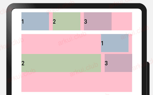
INFO
由运行结果可知,postion 属性会更改子组件的布局结构
相对定位
- offset 不会改变兄弟元素的位置
declare class CommonMethod<T> {
  offset(value: Position): T;
}设置当前组件在父组件中的位置,参照点为自身顶点位置。设置该属性,不影响父容器布局,仅在绘制时进行位置调整。
简单样例如下所示:
Column({ space: 10 }) {
  Row({space: 10}) {
    Text('1')
      .height(50)
      .width('25%')
      .fontSize(16)
      .backgroundColor("#aabbcc")
    Text('2')
      .height(50)
      .width('25%')
      .fontSize(16)
      .backgroundColor("#bbccaa")
    Text('3')
      .height(50)
      .width('25%')
      .fontSize(16)
      .backgroundColor("#ccaabb")
  }
  .width('90%')
  .height(70)
  .backgroundColor(Color.Pink)

  Row({space: 10}) {
    Text('1')
      .height(50)
      .width('25%')
      .fontSize(16)
      .backgroundColor("#aabbcc")
      .offset({ // 使用相对定位,设置组件位置
        x: 10,
        y: 10
      })

    Text('2')
      .height(50)
      .width('25%')
      .fontSize(16)
      .backgroundColor("#bbccaa")
    Text('3')
      .height(50)
      .width('25%')
      .fontSize(16)
      .backgroundColor("#ccaabb")
  }
  .width('90%')
  .height(70)
  .backgroundColor(Color.Pink)
}
.width('100%')
.height("100%")
.padding(10)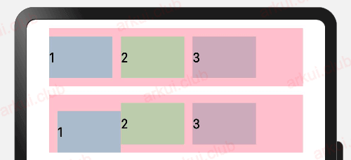
INFO
由运行结果可知,offset 属性只更改组件自身的布局结构。
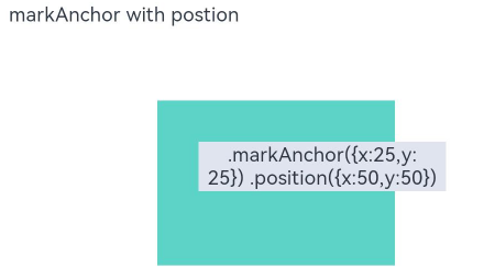
锚点设置(用的少)
- markAnchor 不会改变兄弟元素的位置
declare class CommonMethod<T> {
  markAnchor(value: Position): T;
}设置元素在位置定位时的锚点,以自身顶点位置作为基准点进行偏移。设置该属性,不影响父容器布局,子元素位置也会被改变,仅在绘制时进行位置调整。
一般配合 position 定义 一起使用
Stack({ alignContent: Alignment.TopStart }) {
  Text('.markAnchor({x:25,y:25}) .position({x:50,y:50})')
    ......
    .markAnchor({ x: 25, y: 25 })
    .position({x:50,y:50})
}本例在一个 Stack 组件中添加一个 Text 子组件,同时给 Text 组件添加 position 属性和 markAnchor 属性。Text 组件会先采用 position 的坐标系,以 Stack 组件左上角为原点,移动到(50,50)的位置,再以(50,50)为坐标原点,采用 markAnchor 的坐标系移动到(25,25)的位置,代码如下:
示例图如下:
- 简单举例:
Column({ space: 10 }) {
  Row({space: 10}) {
    Text('1')
      .height(50)
      .width('25%')
      .fontSize(16)
      .backgroundColor("#aabbcc")
    Text('2')
      .height(50)
      .width('25%')
      .fontSize(16)
      .backgroundColor("#bbccaa")
    Text('3')
      .height(50)
      .width('25%')
      .fontSize(16)
      .backgroundColor("#ccaabb")
  }
  .width('90%')
  .height(70)
  .backgroundColor(Color.Pink)

  Row({space: 10}) {
    Text('1')
      .height(50)
      .width('25%')
      .fontSize(16)
      .backgroundColor("#aabbcc")
      .markAnchor({ // 设置锚点
        x: 10,
        y: 10
      })


    Text('2')
      .height(50)
      .width('25%')
      .fontSize(16)
      .backgroundColor("#bbccaa")
    Text('3')
      .height(50)
      .width('25%')
      .fontSize(16)
      .backgroundColor("#ccaabb")
  }
  .width('90%')
  .height(70)
  .backgroundColor(Color.Pink)
}
.width('100%')
.height("100%")
.padding(10)运行结果如下图所示:
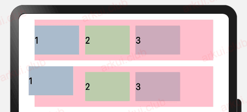
由运行结果可知,markAnchor 属性只更改组件自身的布局结构。
约束条件(用的更少)
declare class CommonMethod<T> {
  alignRules(value: AlignRuleOption): T;
}

// 约束规则
declare interface AlignRuleOption {
  left?: { anchor: string, align: HorizontalAlign };
  right?: { anchor: string, align: HorizontalAlign };
  middle?: { anchor: string, align: HorizontalAlign };
  top?: { anchor: string, align: VerticalAlign };
  bottom?: { anchor: string, align: VerticalAlign };
  center?: { anchor: string, align: VerticalAlign };
}设置子组件在父组件 RelativeContainer 中的对齐方式,分为水平对齐规则和竖直对齐规则,分别说明如下
水平对齐规则
- left:设置子组件左对齐,如果子组件宽度小于父组件宽度,则子组件会向右对齐
- right:设置子组件右对齐,如果子组件宽度小于父组件宽度,则子组件会向左对齐
- middle:设置子组件居中对齐,如果子组件宽度小于父组件宽度,则子组件会向左右对齐
竖直对齐规则
- top:设置子组件顶部对齐,如果子组件高度小于父组件高度,则子组件会向下对齐
- bottom:设置子组件底部对齐,如果子组件高度小于父组件高度,则子组件会向上对齐
- center:设置子组件居中对齐,如果子组件高度小于父组件高度,则子组件会向上、向下对齐
简单样式如下
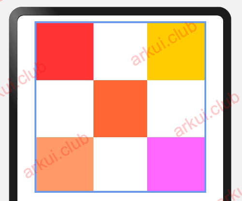
RelativeContainer() {
  Row()
    .width(100)
    .height(100)
    .backgroundColor("#FF3333")
    .alignRules({
      top: {
        anchor: "__container__",
        align: VerticalAlign.Top
      },
      left: {
        anchor: "__container__",
        align: HorizontalAlign.Start
      }
    })
    .id("row1")

  Row()
    .width(100)
    .height(100)
    .backgroundColor("#FFCC00")
    .alignRules({
      top: {
        anchor: "__container__",
        align: VerticalAlign.Top
      },
      right: {
        anchor: "__container__",
        align: HorizontalAlign.End
      }
    })
    .id("row2")

  Row().height(100)
    .backgroundColor("#FF6633")
    .alignRules({
      top: {
        anchor: "row1",
        align: VerticalAlign.Bottom
      },
      left: {
        anchor: "row1",
        align: HorizontalAlign.End
      },
      right: {
        anchor: "row2",
        align: HorizontalAlign.Start
      }
    })
    .id("row3")

  Row()
    .backgroundColor("#FF9966")
    .alignRules({
      top: {
        anchor: "row3",
        align: VerticalAlign.Bottom
      },
      bottom: {
        anchor: "__container__",
        align: VerticalAlign.Bottom
      },
      left: {
        anchor: "__container__",
        align: HorizontalAlign.Start
      },
      right: {
        anchor: "row1",
        align: HorizontalAlign.End
      }
    })
    .id("row4")

  Row()
    .backgroundColor("#FF66FF")
    .alignRules({
      top: {
        anchor: "row3",
        align: VerticalAlign.Bottom
      },
      bottom: {
        anchor: "__container__",
        align: VerticalAlign.Bottom
      },
      left: {
        anchor: "row2",
        align: HorizontalAlign.Start
      },
      right: {
        anchor: "__container__",
        align: HorizontalAlign.End
      }
    })
    .id("row5")
}
.width(300)
.height(300)
.border({ width: 3, color: "#6699FF" })样例运行结果如下图所示:
有关约束规则的使用详见第 5 章 第 9 节 的介绍。
背景设置
背景色设置
export declare class CommonMethod<T> {
  backgroundColor(value: ResourceColor): T;
}

declare type ResourceColor = Color | number | string | Resource;设置组件的背景颜色, ResourceColor 类型支持 Color | number | string | Resource 四种。
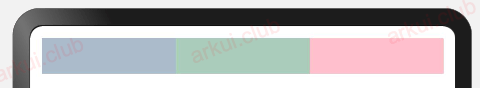
简单样例如下图所示:
Row() {
  Text()
    .height(30)
    .backgroundColor("#aabbcc")
    .layoutWeight(1)

  Text()
    .height(30)
    .backgroundColor("#aaccbb")
    .layoutWeight(1)

  Text()
    .height(30)
    .backgroundColor(Color.Pink)
    .layoutWeight(1)
}样例运行结果如下图所示:
背景图是否重复
export declare class CommonMethod<T> {
  backgroundImage(src: ResourceStr, repeat?: ImageRepeat): T;
}设置组件的背景图片,repeat 参数可以设置图片的填充模式,简单样例如下所示:
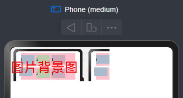
 Text("图片背景图")
      .fontSize(30)                          // 设置文字大小
      .fontColor(Color.Red)                  // 设置文字颜色
      .size({width: 220, height: 90})        // 设置图片的宽高
.backgroundImage('https://file.jsopy.com/JSOPY/QianDuan/HongMeng/ArkUIShiZhan/HONGMENG_24_06_18_02.png',ImageRepeat.X) // 设置组件的背景图片这就表示横向平铺
边框设置
边框样式
export declare class CommonMethod<T> {
  border(value: BorderOptions): T;
	borderStyle(value: BorderStyle): T;
	borderWidth(value: Length): T;
	borderColor(value: ResourceColor): T;
	borderRadius(value: Length): T;
}设置组件的边框样式,支持设置边框颜色、边框粗细、边框圆角以及边框的展示样式。同时设置 border 和 borderXXX ,以最后设置的值为准。
简单样式如下:
 Text()
      .width(50)
      .height(70)
      .layoutWeight(1)
      .border({
        color: {
          top: Color.Blue,
          left: Color.Black,
          right: Color.Red,
          bottom: Color.Green
        },
        width: {
          top: 2,
          left: 5,
          right: 10,
          bottom: 10
        },
        radius: {
          topLeft: 20,
          topRight: 10,
          bottomLeft: 10,
          bottomRight: 30
        },
        style: {
          top: BorderStyle.Dotted,
          left: BorderStyle.Dashed,
          bottom: BorderStyle.Solid,
          right: BorderStyle.Dotted
        }
      })
      .margin({
        top: 30,
        left: 20,
})显示隐藏设置
显示和隐藏设置
export declare class CommonMethod<T> {
  visibility(value: Visibility): T;
}

declare enum Visibility {
    Visible,
    Hidden,
    None
}设置组件的显示和隐藏, Visibility 类型说明如下:
Visible(默认值):组件显示在页面上。Hidden:组件在屏幕上占位但是不显示。None:组件在屏幕上不显示也不占用位置。
Row() {
  Text()
    .height(30)
    .width(120)
    .backgroundColor("#aabbcc")
    .layoutWeight(1)

  Text()
    .height(30)
    .backgroundColor("#aaccbb")
    .visibility(Visibility.Visible) // 设置默认值Visible
    .layoutWeight(1)

  Text()
    .height(30)
    .backgroundColor(Color.Pink)
    .layoutWeight(1)
}

Row() {
  Text()
    .height(30)
    .width(120)
    .backgroundColor("#aabbcc")
    .layoutWeight(1)

  Text()
    .height(30)
    .backgroundColor("#aaccbb")
    .visibility(Visibility.Hidden) // 设置Hidden,不在界面显示但是还占着位置
    .layoutWeight(1)

  Text()
    .height(30)
    .backgroundColor(Color.Pink)
    .layoutWeight(1)
}

Row() {
  Text()
    .height(30)
    .backgroundColor("#aabbcc")
    .layoutWeight(1)

  Text()
    .height(30)
    .visibility(Visibility.None) // 设置None,不在界面上显示
    .backgroundColor("#aaccbb")
    .layoutWeight(1)

  Text()
    .height(30)
    .backgroundColor(Color.Pink)
    .layoutWeight(1)
}运行结果如下图所示:
显示优先级设置
export declare class CommonMethod<T> {
  displayPriority(value: number): T;
}设置当前组件在布局容器中显示的优先级,当父容器空间不足时,低优先级的组件会被隐藏,该属性仅在 Row 、Column、和 Flex(单行) 容器组件中生效。
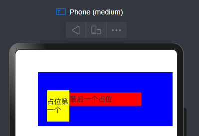
简单样例如下所示:
    Row() {
      Text("占位第一个")
        .width(50)
        .height(70)

        .margin({
          top: 30,
          left: 20,
        })
        .backgroundColor(Color.Yellow)
        .visibility(Visibility.Visible).displayPriority(3)
      Text("如果超出要隐藏的").width(100).displayPriority(1).backgroundColor(Color.Green)
      Text("最后一个占位").width(160).height(30).displayPriority(4).backgroundColor(Color.Red)
    }.width(300).backgroundColor(Color.Blue).height(120).margin({
      top:50,
      left:50
})INFO
这里我把 Text(最后一个占位)的宽度设成 160,这样就会超出这个宽度,那种中间的那个元素就是被隐藏
如果你把 ext(最后一个占位)的宽度设成 100,这样宽度就不会超出,中间那个元素就会被显示
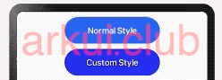
多态样式
多种状态样式设置
export declare class CommonMethod<T> {
  stateStyles(value: StateStyles): T;
}

declare interface StateStyles {
  normal?: any;
  pressed?: any;
  disabled?: any;
  focused?: any;
  clicked?: any;
}设置组件在不同状态下的显示样式,目前只支持通用属性, StateStyle 定义了以下几种状态:
normal:设置组件默认情况下的显示样式。
pressed:设置组件按下时的显示样式。
disabled:设置组件不可用时的显示样式。
focused:设置组件获取焦点时的显示样式。
clicked:设置组件点击时的显示样式。
简单样式如下:
Button("Normal Style")
  .width(180)
  .height(50)

Button("Custom Style")
  .width(180)
  .height(50)
  .stateStyles({
    normal: { // 设置默认情况下的显示样式
      .backgroundColor(Color.Blue)
    },
    pressed: { // 设置手指摁下时的显示样式
      .backgroundColor(Color.Pink)
    }
})运行结果如下图所示:
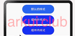
@Styles 样式设置
- 不能传递参数
@Styles 作用是提取组件的公共样式,方便其他组件复用样式,它可以定义在组件内部或者组件外部,当定义在组件外部时需要添加 funcition 关键字,简单样例如下所示:
@Styles function btnGlobalPressedStyle() { // 组件外定义的按钮摁下的样式
  .backgroundColor(Color.Pink)
  .width(180)
  .height(50)
}

@Styles function btnGlobalNormalStyle() {  // 组件外定义的按钮默认的样式
  .backgroundColor(Color.Blue)
  .width(180)
  .height(50)
}


@Entry @Component struct Index {

  @Styles btnPressStyle() {                // 组件内定义的按钮摁下的样式
    .backgroundColor(Color.Pink)
    .width(180)
    .height(50)
  }

  @Styles btnNormalStyle() {                // 组件内定义的按钮默认的样式
    .backgroundColor(Color.Blue)
    .width(180)
    .height(50)
  }

  build() {
    Column({space: 10}) {

      Button("默认的样式")
        .width(180)
        .height(50)

      Button("组件外样式")
        .stateStyles({
          normal: btnGlobalNormalStyle,     // 使用组件外定义的按钮默认的样式
          pressed: btnGlobalPressedStyle    // 使用组件外定义的按钮摁下的样式
        })

      Button("组件内样式")
        .stateStyles({
          normal: this.btnNormalStyle,      // 使用组件内定义的按钮默认的样式
          pressed: this.btnPressStyle       // 使用组件内定义的按钮摁下的样式
        })
    }
    .width('100%')
    .height('100%')
    .padding(10)
  }
}运行结果如下图所示:
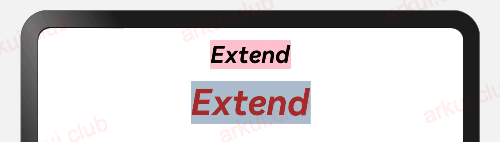
@Extend 样式设置
在 UI 构建中,如果组件设置的属性都是相同的,比如 Text 组件的 fontColor、fontSize 等设置都一致,那么可以使用 @Extend 对 Text 组件进行扩展,提取相同的属性部分,这样可以有效降低代码量。简单样例如下所示:
@Extend(Text) function textStyle(size: number = 20, color: ResourceColor = Color.Black, bgColor: ResourceColor = Color.Pink) {
  .fontSize(size)
  .fontColor(color)
  .backgroundColor(bgColor)
  .fontStyle(FontStyle.Italic)
  .fontWeight(FontWeight.Bold)
}

@Entry @Component struct Test {

  build() {
    Column({ space: 10 }) {
      Text("Extend")
        .textStyle()

      Text("Extend")
        .textStyle(30, Color.Brown, "#aabbcc")
    }
    .width('100%')
    .height("100%")
    .padding(10)
  }
}样例运行结果如下图所示:
INFO
@Extend 装饰器不能定义在 struct 内部,暂时无法在其它页面引入 Extend 样式。
渐变色
渐变样式设置
export declare class CommonMethod<T> {
  linearGradient(value: {
    angle?: number | string;
    direction?: GradientDirection;
    colors: Array<any>;
    repeating?: boolean;
  }): T;
}设置组件的渐变样式,参数说明如下:
angle:设置渐变的角度。
direction:设置渐变方向,是 angle 的抽象
colors:渐变颜色数组,例如设置如下:
简单代码如下
.linearGradient({
  angle: 180, // 设置渐变角度
  colors: [['#BDE895', 0.1], ["#95DE7F", 0.6],  ["#7AB967", 1]] // 设置渐变颜色
})组件渐变色方向旋转 180° ,在 [0 ~ 0.1] 区间渐变色为 #BDE895,在 [0.1, 0.6] 区间渐变色由 #BDE895 线性渐变成 #95DE7F ,在 [0.6, 1.0] 区间渐变色由 #95DE7F 线性渐变成 #7AB967 。
repeating 是否重复渲染
简单样例如下图所示:
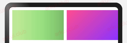
Text()
  .size({width: 0, height: '100%'})
  .layoutWeight(1)
  .linearGradient({
    angle: 90,
    colors: [['#BDE895', 0.1], ["#95DE7F", 0.6],  ["#7AB967", 1]]
  })

Text()
  .size({width: 0, height: '100%'})
  .layoutWeight(1)
  .linearGradient({
    angle: 135,
    colors: [['#ff4c8f', 0], ["#8933ff", 1]]
})样例运行结果如下图所示:
小结
本节简单介绍了 APP 开发过程中常用的组件样式,更多其它样式读者可参考官方文档,本节使用的组件如 Text、Button 等组件在后续章节部分都有做详细的使用介绍,读者先暂时了解用法即可。